Featured under | Design Tips
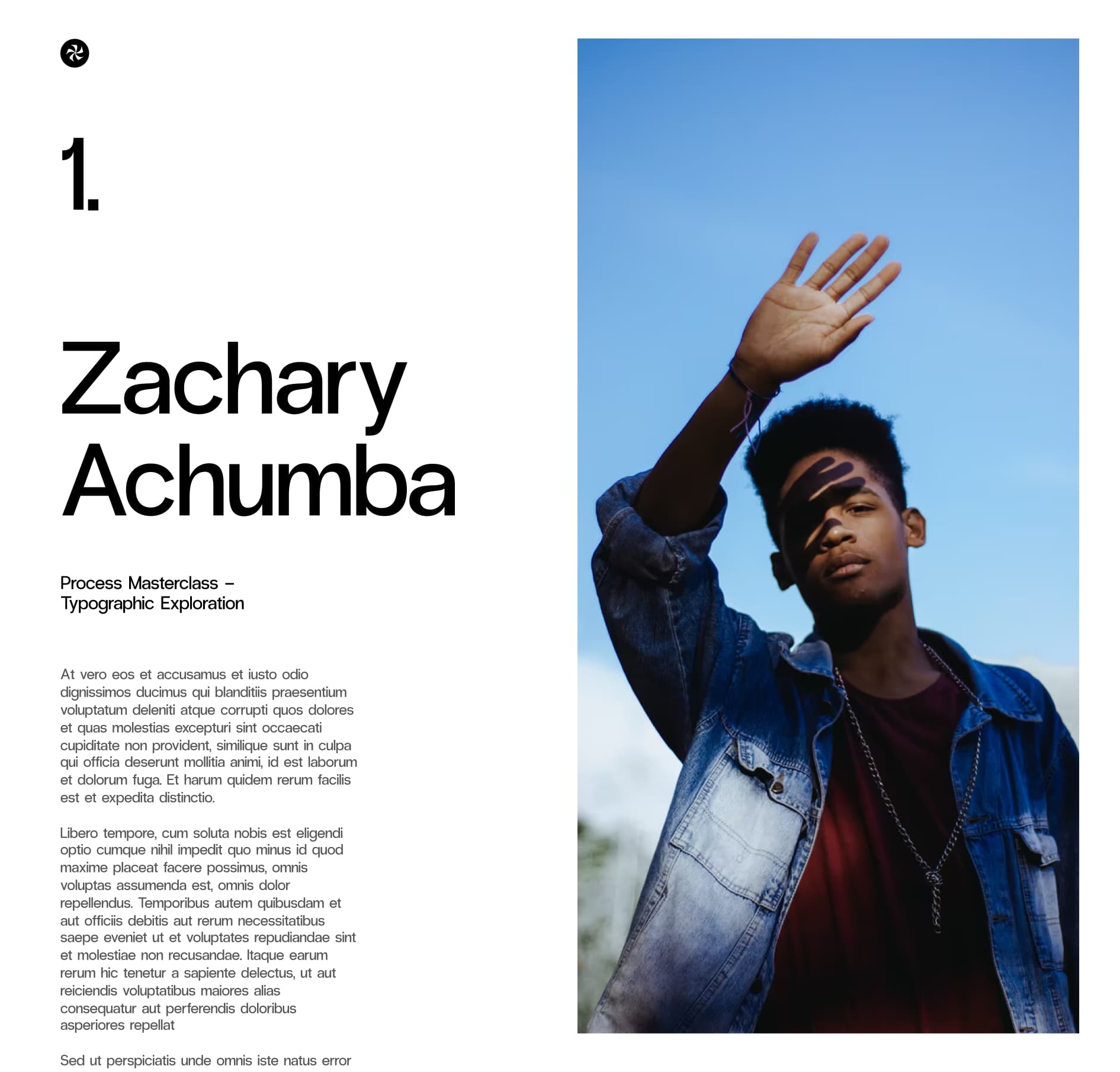
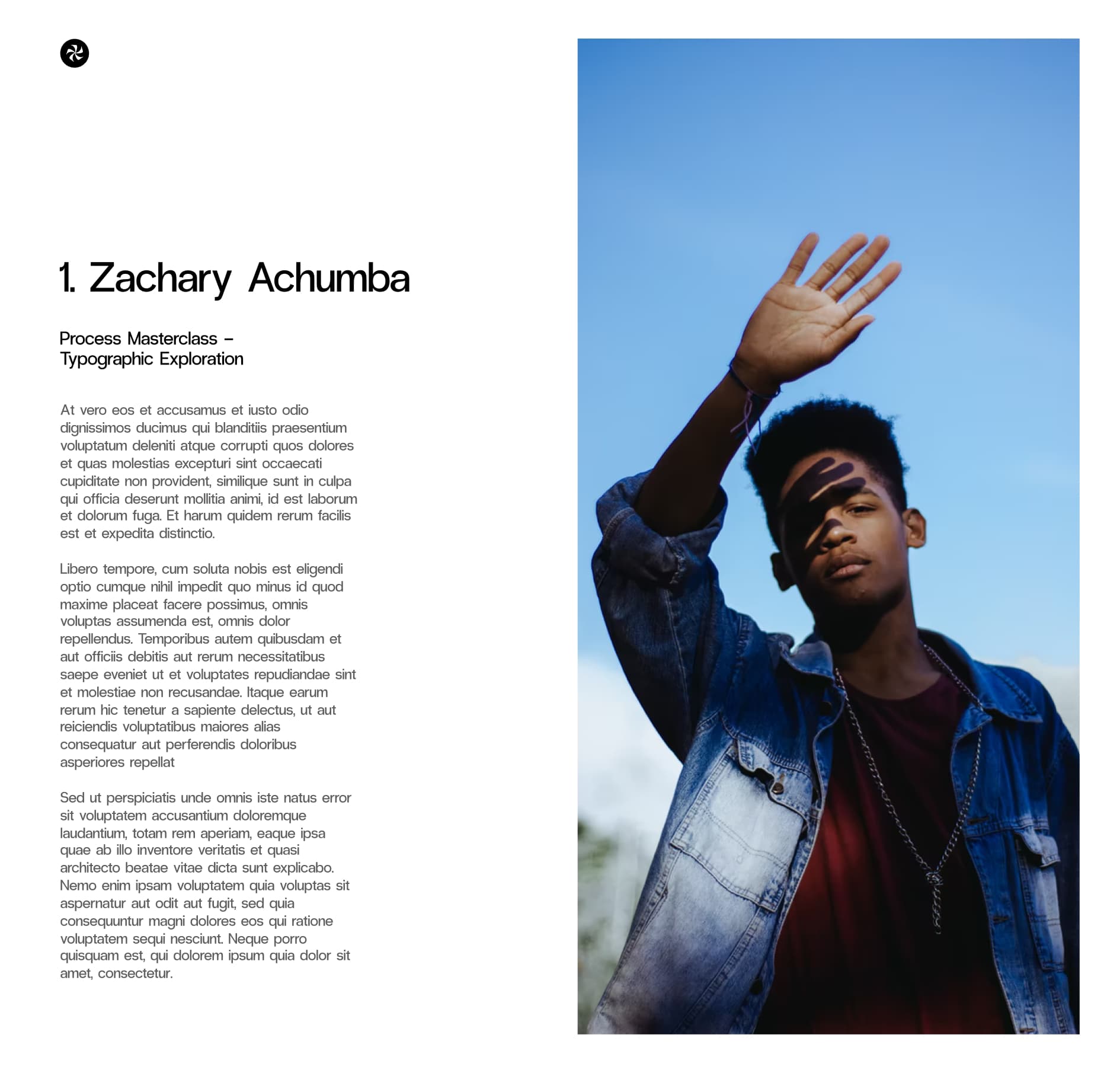
Volume 01.
Typography Tips
In this feature I go through typographic tips that are great building blocks for digital design work. Build a solid foundation with this typography series as I share my ins and outs for using type.
Welcome to Volume 01. of our Typography series. I get a lot of questions and comments like “Hey man I really like your work its always clean AF. How did you learn and can you share some tips? The type in your work is always so crisp.” Then I’d share one or two tips about what I think works and try to help out whenever I could. Whilst helpful I always felt that I couldn’t really write all that I wanted to say into a catch all reply that’s a paragraph long or a simple tweet.
The reality is it just took a lot of time doing projects and building an eye for what works and what doesn’t. And the influences I’ve had during my design career over the last 15 years. But an answer like this wouldn’t be that helpful to other designers.
In the end it really is about just doing a lot little things really really well. And the sum total of all that is what makes things great.
As designers we all get shiny object syndrome. What’s the latest trend, what design tool should we be using, look at this new AI tool, wow figma has new updates, or this prototype tool is sick. NFTS, Metaverse, web 3.0, crypto, VR/AR, Voice is the new frontier! Whilst all amazing things, we sometimes gloss over the fundamentals. You know the stuff that sticks with you throughout your design career. The level of craft in design that doesn’t get as much attention or love these days.
Timeless things like good typography.
So here I decided to share my building blocks for great type in digital design. And bring to you some references and things to think about when designing. This will be an ongoing series - but the first concept that encompasses much of what I want to say on type is about Contrast. Yep doesn’t sound very riveting does it...but hear me out.
You may know the gist of this already as every designer has a rough understanding of what contrast is. But there’s a difference between roughly knowing something to thoroughly understanding the basics and eventually mastering it. If you get that right you’ll have the right building blocks for everything else. If you have a solid foundation you can build upon that to build sound and complex designs.

It’s the whole Mr. Miyagi wax on wax off thing. Simple ideas executed well consistently creates extraordinary results.
So when it comes to using and controlling type, think about how you can use contrast to great effect to:
- Emphasise or de-emphasise text
- Create order and hierarchy
- Evoke emotion
- Promote readability and ease of use
- Make the damn work beautiful
Contrast when it comes to typography is that ability to play with light and shade. Like playing a musical score with ebbs and flows. Mastering contrast is the first step to being great with type, and ultimately being a great designer. When it comes to UI design I've broken it down into size, weight, transforms, color, styles and type. We will be going through each in this guide, so grab your favourite beverage, grab a seat and buckle up, it’s going to be a long ride. LFG!!

How to get the most out of this guide
Go through each of these typographic contrast creators. How many variations do you have in your repertoire? And how well you can use each when given a project? I'm sure you are great at some and weak at others. Either double down on your strengths or improve the areas where you are weak at. Then practice different combinations and ideas, no matter how basic it seems, on personal practice projects and live projects. So let’s look at these 6 fundamental ideas.
Work set in Radio Grotesk via PangramPangram©
01. Typographic Size
You can easily create distinctions between the meaning of text, it’s readability and contrast just by playing around with the size of fonts. Even with just one font you can create contrast and magic.
Use size to create hierarchy
Think of using different font sizes to create hierarchy and contrast. Decide what it is you want the user to understand first. What devices will they be interacting with the design solution? Mobile, desktop, watch, kiosk, VR? Who are your users? Do they have good eye sight or are visually impaired? Become user-centric in the way you approach and think about your design work. Think holistically and not just the pixels in front of you.
Consider the above example and the contrast that's created with my type choices. What's larger will be easily scannable and read first, and it's what I've used for the headlines. For long format text that is meant to be read a size 3 in hierarchy in this case is more suitable. When you create clear distinctions like this in your mind– you can begin to give meaning and systemise your type system. Many designers learn this subconsciously - but when you can verbalise your thoughts you can present a stronger case when presenting to stakeholders.
Sometimes you want more or less contrast
The more variance in size the more contrast you can create. Compare the contrast between the two examples below.
Sometimes big type can be used to great effect, either as a stylistic choice or for readability.
Alternatively if you want to be more invisible - lower the variance in contrast, it creates less impact but still provides sufficient clarity.
What starts off simple can slowly expand into it’s own visual and typographical language.
Use size and scale to emphasise importance and priority
What are the user and business goals and objectives of each section? Reflect that in the type choices and hierarchy that you create.
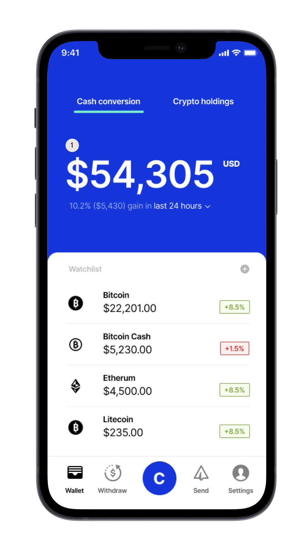
Portfolio Balance is the most important piece of information on this screen.
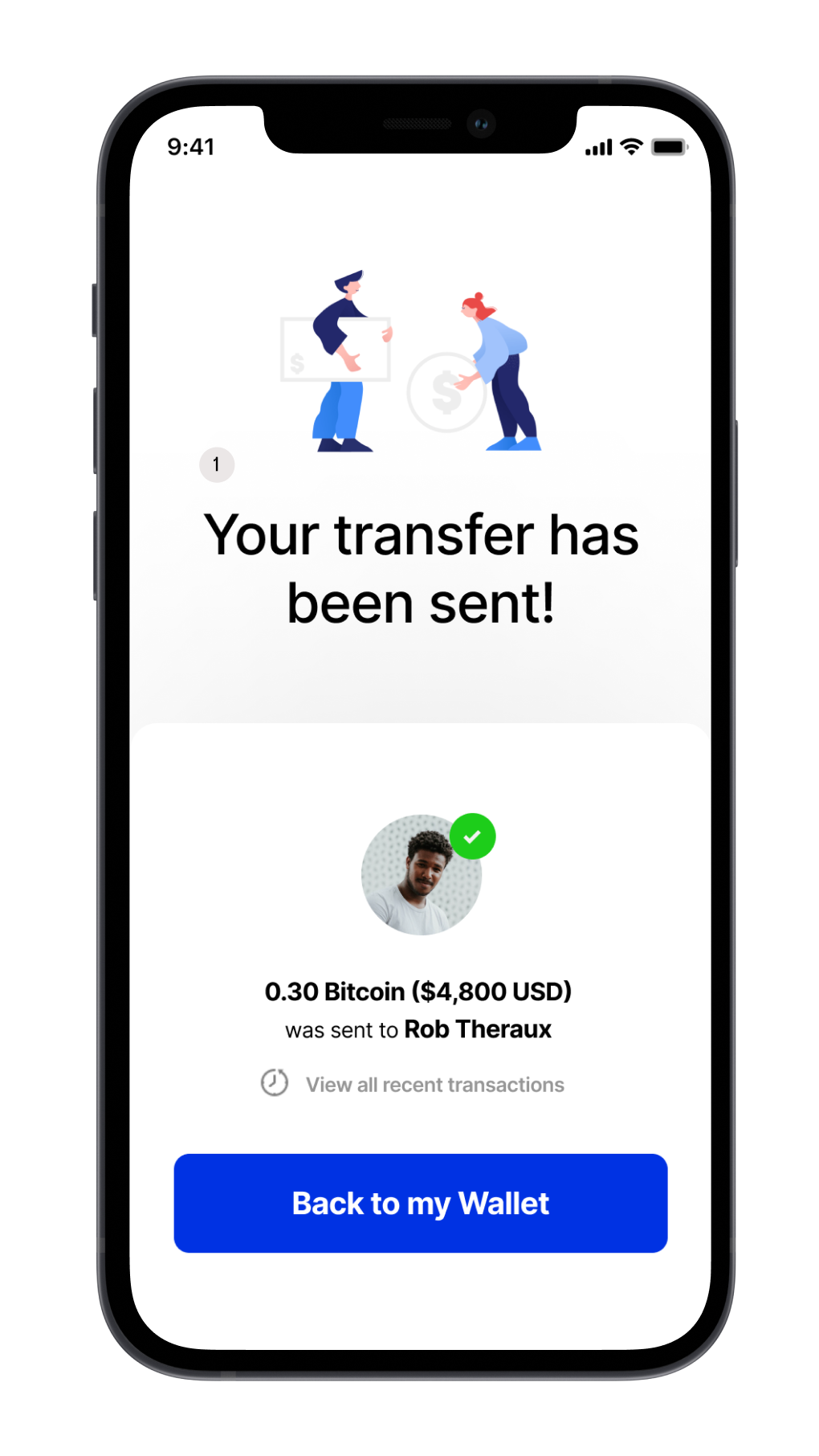
Your transfer has been sent is the most important piece of information on this screen.
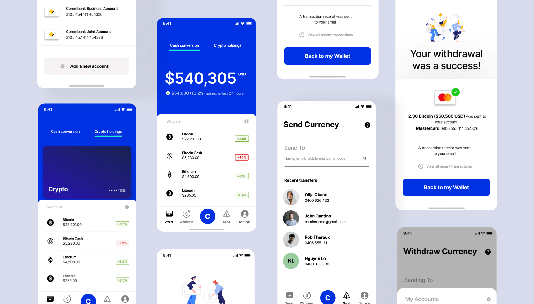
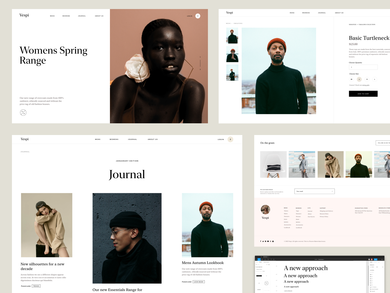
Have a look at the above crypto app that I designed. Consider the font size of the ‘Portfolio balance $54,305’ and ‘Your transfer has been sent’. In both of these instances that is the key information that we want users to understand and read at a glance. That is the users priority - based on the most common users goals and use cases for each screen and flow. What does Sam (our user persona) want to do 90% of the time on this screen? He wants to check the balance of his portfolio.
We use size and scale to create emphasis and importance for specific pieces of information on a screen or page. When designing - think about how you can create more contrast with type to create clear distinctions of information on a page or screen. Then systemise those sizes to create consistency, meaning and affilliation using a design system and component library.
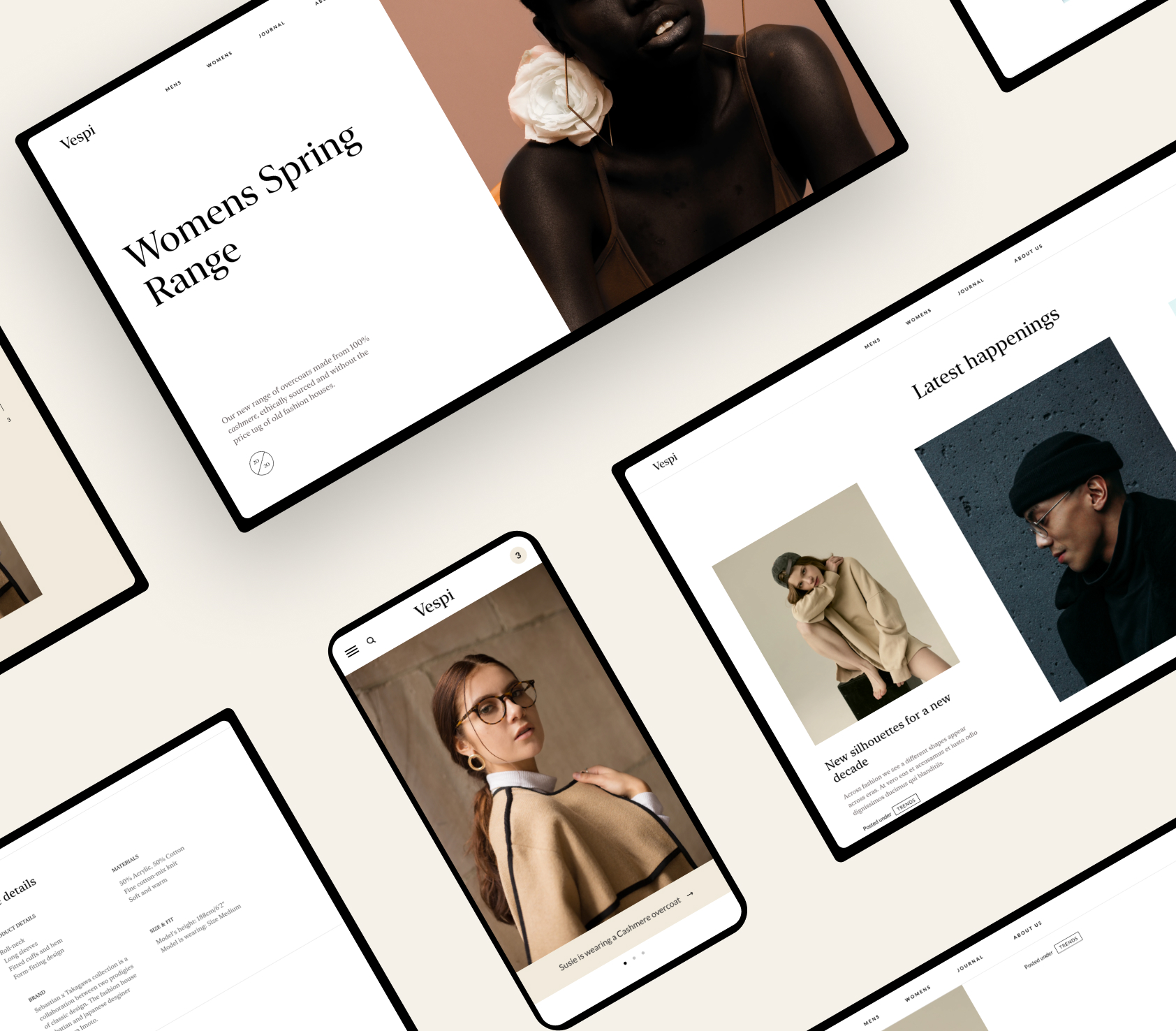
Project from the Process Masterclass ©
Size can also be used to create aesthetic typographic combinations
Size can be used for function and hierachy. But it can also be used to give form and beauty. By using different sizes we can create interesting typographic lock ups. You know the kind of designs that make other designers say ‘holy shit!’ and pat you on the back ← which shouldn’t be your only goal ? But beautiful work can make users feel something! Nike makes you feel something. Apple, Tiffany and Co. the type choices mixed with other visual elements can give the aesthetic meaning. Luxury, Utility, Bold, Playful.
On the left we have our reference source - and on the right we have my design which is based on the contrast ideas and the type composition from the reference source. Smaller text stacked with big text like a burger creates a specific contrast and aesthetic. It works whether it's serif or a san serif typeface like my design example on the right.
☞ Action Tip: There are great examples where you can extract contrast ideas from. Look at the designs that inspire you and see what contrast mechanisms they use, and try to learn from it and bring it into your own work. This example here is mainly for headlines. But it can be for subtitles, buttons, form fields any UI element that has type attached to it. Find those examples and copy it and build upon it.
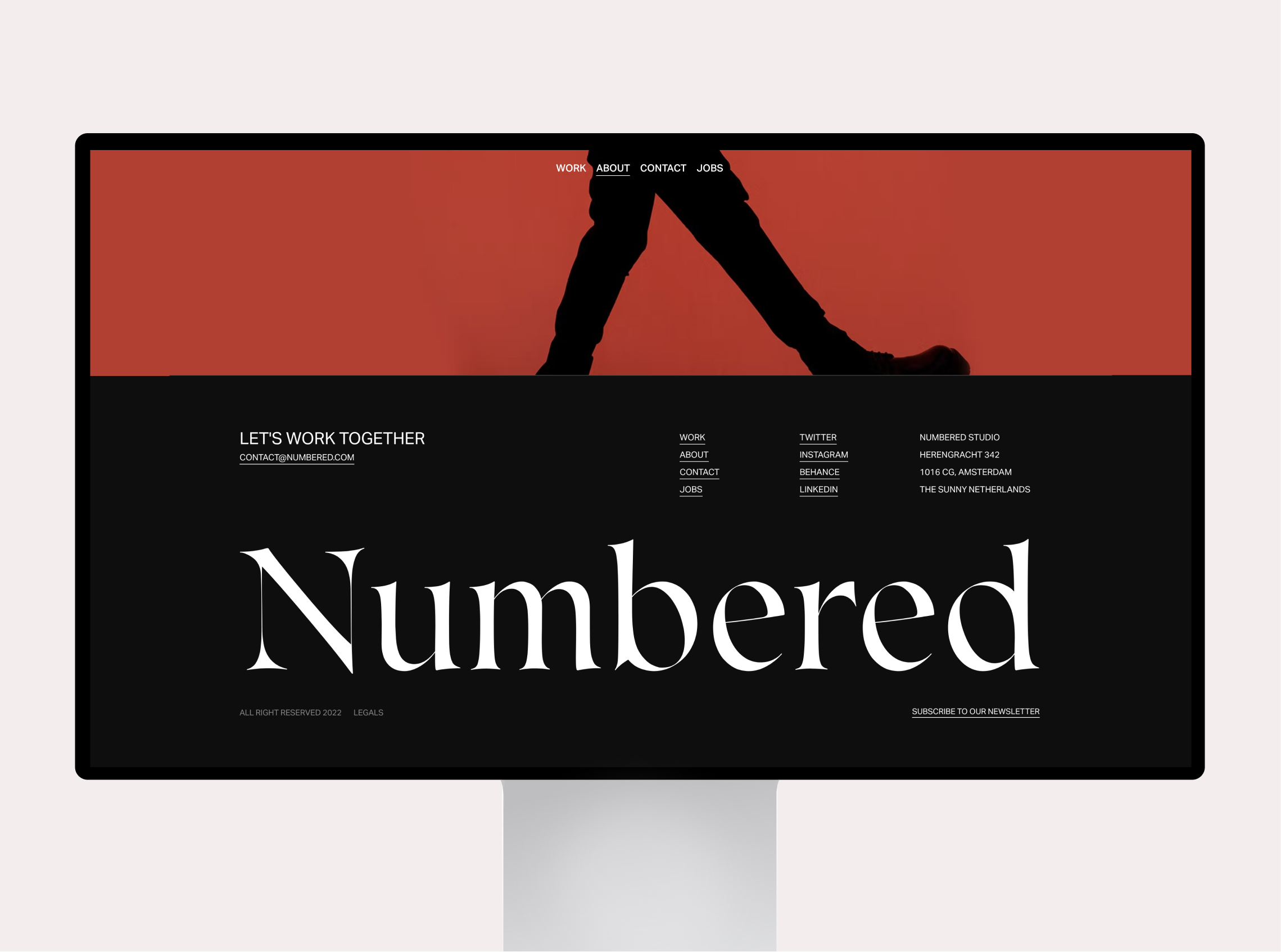
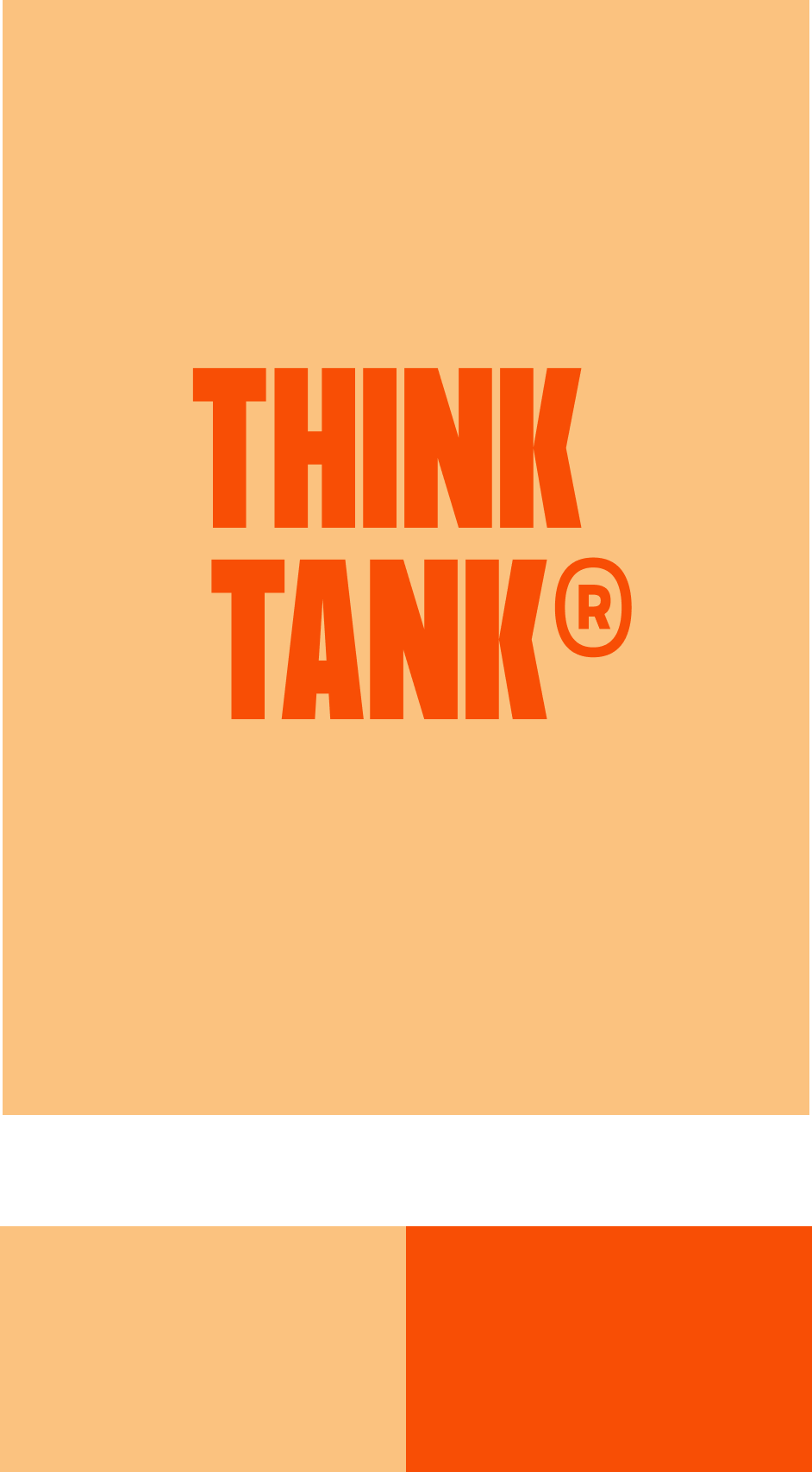
Here we see Numbered Studio use a big logo masthead with great stylistic effect. The big letters contrast boldly with the rest of the pages layout. This is a great example of a big idea that you can extract into your own work and projects. One big bold type element as a masthead or footer. See how this pattern is used on other sites.
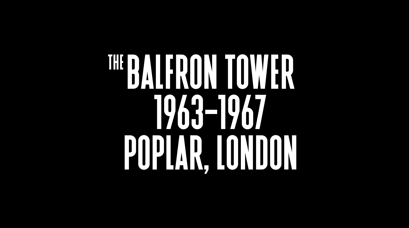
Font and reference is II Balfron
Here we can see the clever use of sizing to create an interesting contrast in type. The word ‘THE’ creates a beautiful intrigue and lockup to the rest of the information. In the end you get something that looks interesting whilst emphasising the important information of everything else. It's these little big ideas that can take your typographic game to the next level.
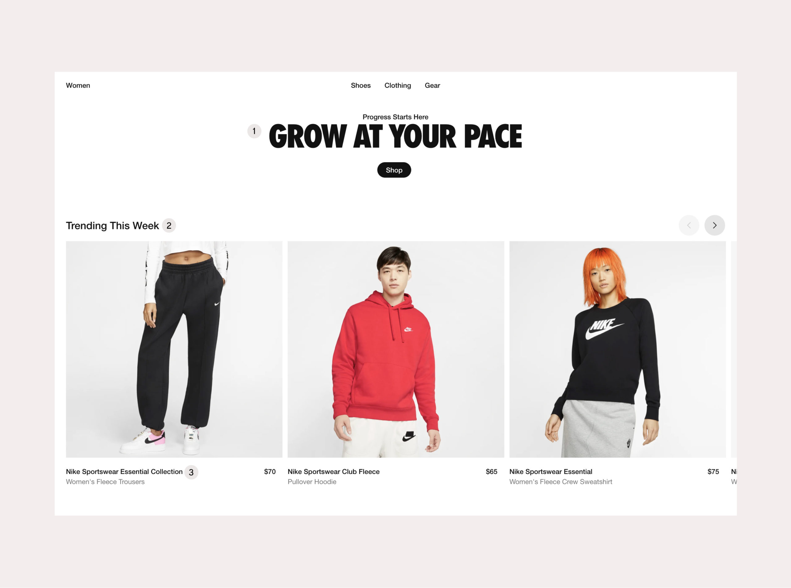
Here we can see the clear hierarchy and contrast being used to present information on the Nike site. I've labeled them 1 to 3.
- What page section is this? Grow at your own pace – Shop
- What is the category title in this section? Trending This Week
- What product is this? Nike Sportswear Essential Collection
Soon you will see that you can use other contrast mechanisms like size and weight to create hierarchy.
02. Font Weights
We can use the same typeface - but just by using different font weights we can create contrast. The thickness or thinness of font weights can create interesting ideas when you need differentiation, emphasis, deemphasis and meaning.


A couple of examples and illustrations on font weights. Here I've used:
- Neue Montreal - Light and Bold
- Formula Condensed - Bold and Light
- Moneta - Black and Light
Learn about different typefaces and the font-weights that are available at your disposal to create contrast.
Here I've taken advantage of the font-weights in Neue Montreal that I explored earlier and created a compelling design banner/marque. You can see how type can be used with images and video. Simple ideas layered on top can create interesting results. This graphic would work great for an editorial site or news app.
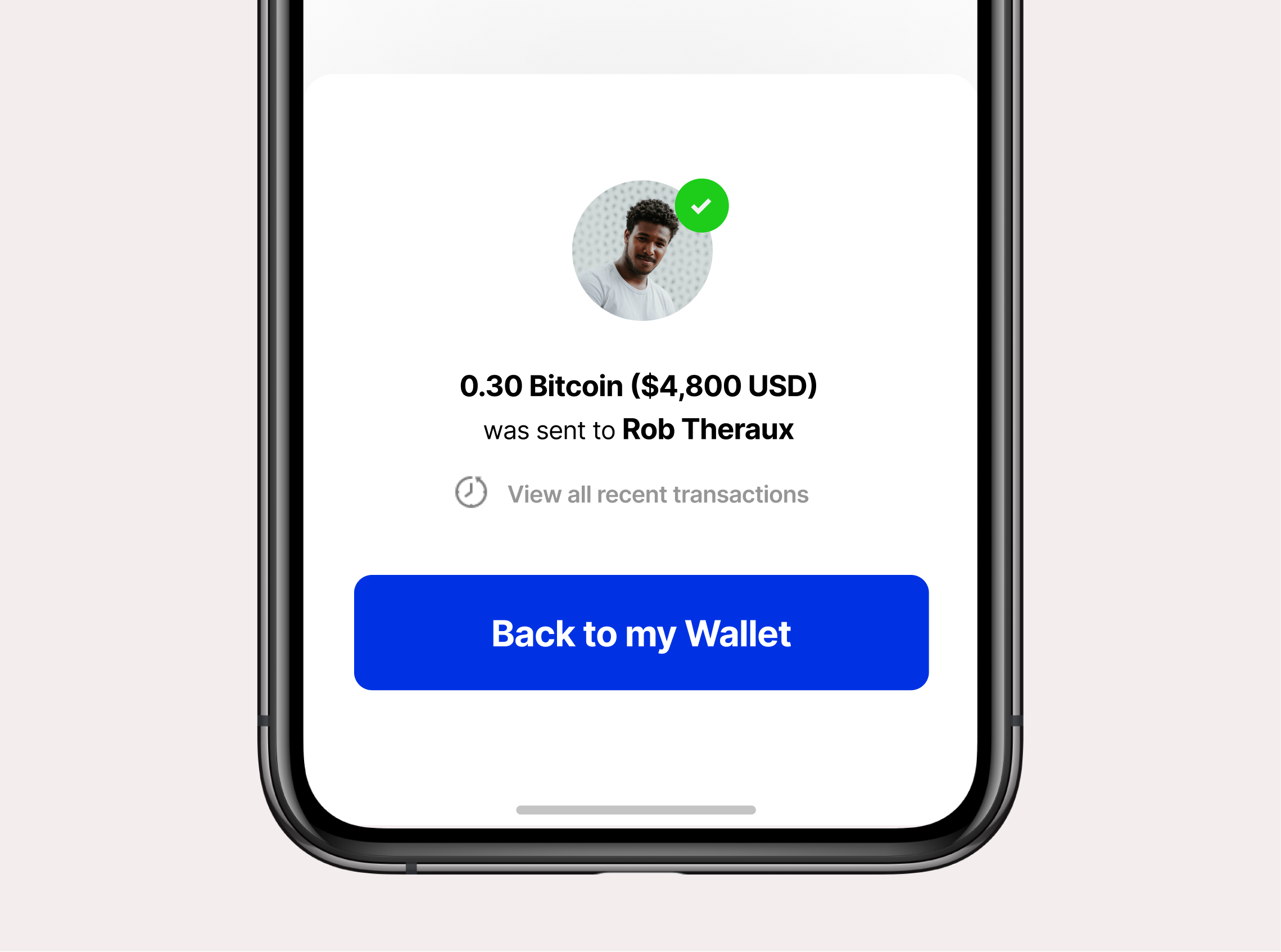
Here we look at a text example of details in an app I designed. 0.30 Bitcoin ($4,800 USD) and Rob Theraux has a thicker font weight here. You can use thicker font weights or text transforms like bold to emphasise key information like in this. Use contrast to give information a different meaning.
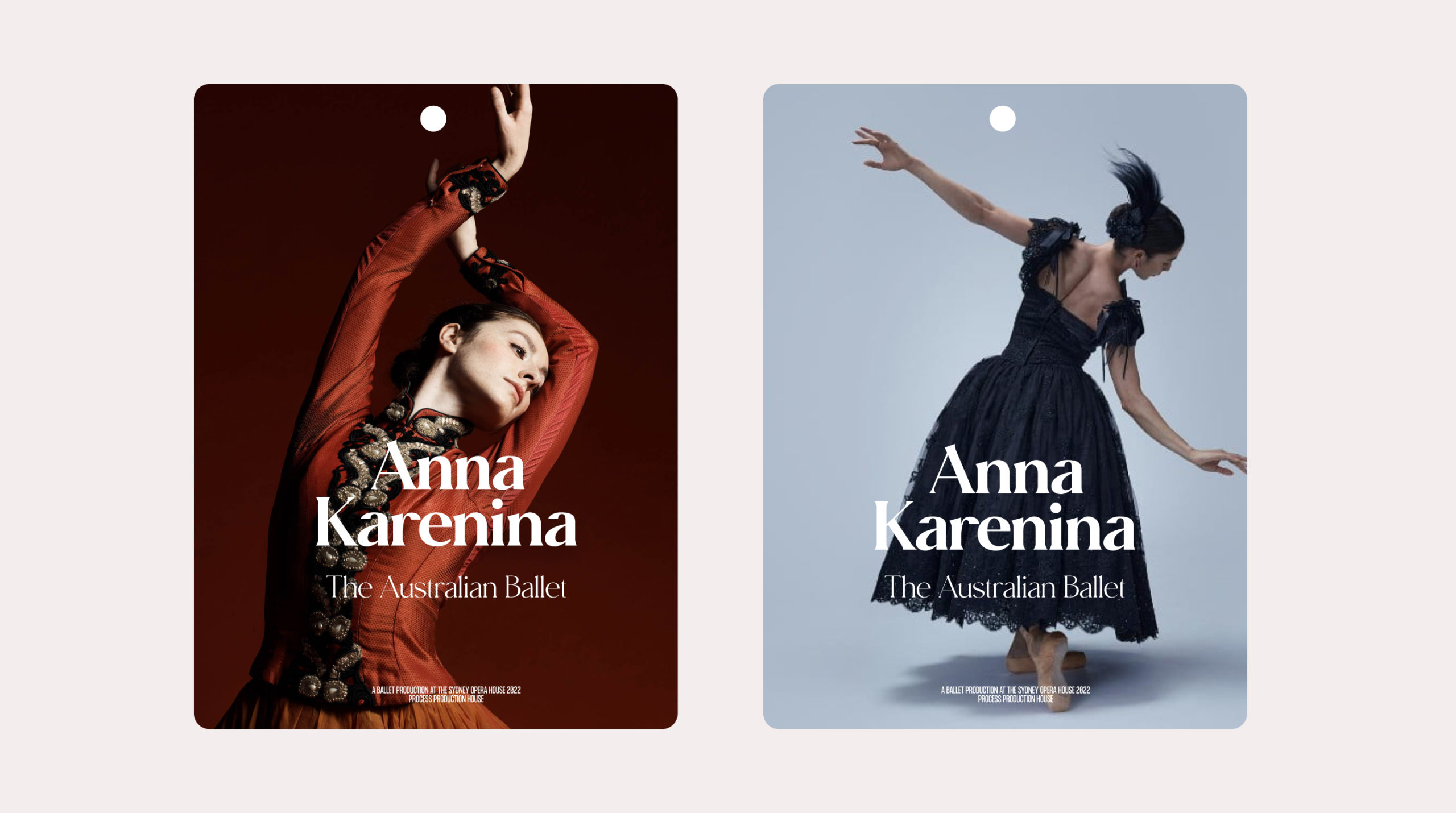
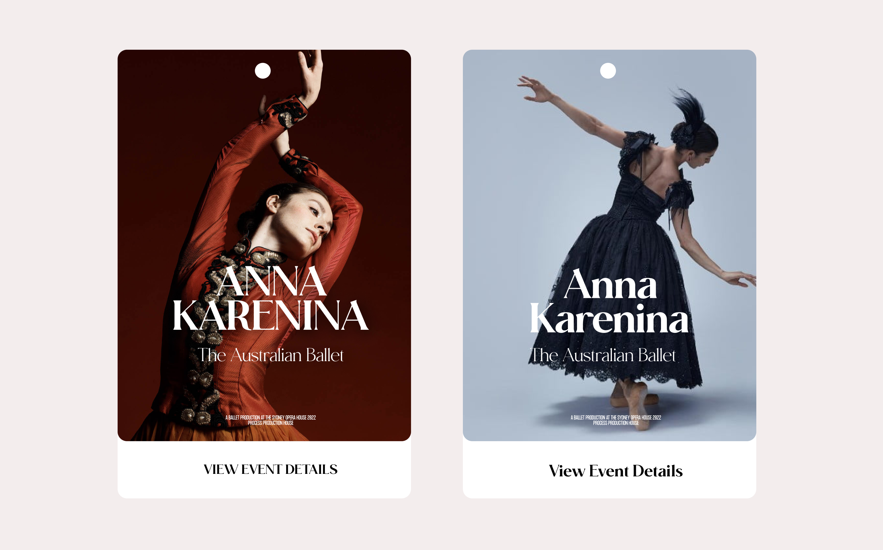
Here I use Size and Weight with Moneta to create this Headline lockup. Images courtesy of Australian Ballet.
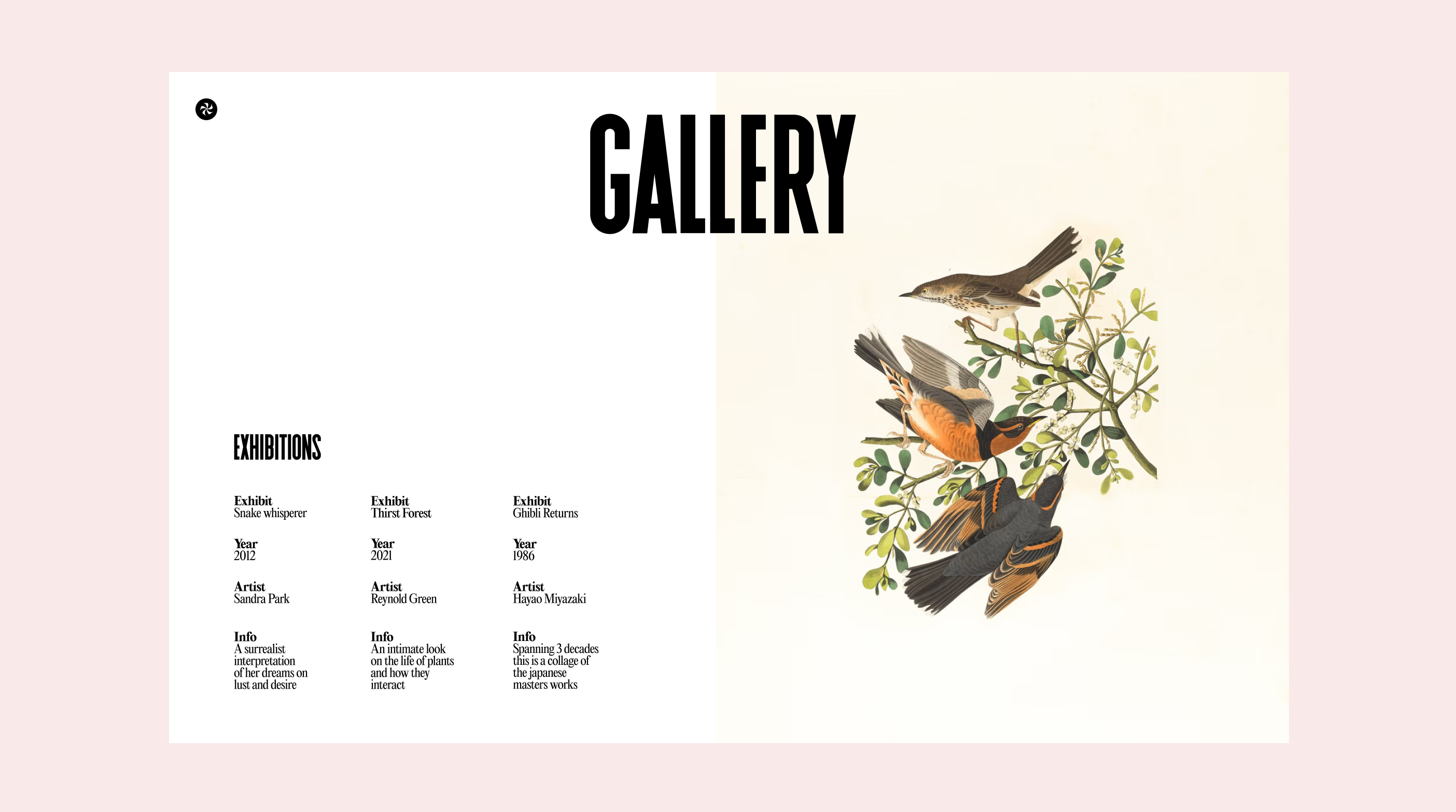
We have II Balfron as the headline GALLERY. Here we use thicker font weights for the category titles in this layout and contrasting the details with a regular font weight using Editorial New. Using both size and weights here to create contrast and layout. Contrast and layout wise this is a very swiss graphic design layout. Even though my work is predominantly digital I've taken a lot of inspiration and learnings from traditional graphic design. Both when I started my career at a branding/digital agency to my later years.
☞ Action Tip : Try to recreate some of the layouts and ideas here in Figma. Expand your inspiration pool beyond just digital design.
03. Text Transforms
By using various text transforms we can create more meaning and contrast with our work.
Mental Note: If you think all of this is simple, that's because it is. Who doesn't know about lowercase and uppercase. Or bold and italic. But within simplicity there is a level of expertise.
Think is sushi rice just sushi rice?
Cook a bit of rice and add vinegar right? Well there's a clear difference when a trainee spends one year under a sushi master – to learn how to prepare the best rice and vinegar ratio and preparation vs. one that just learnt from a recipe book or store bought.
There's a level of detail and care in the craft.
The merging of simplicity and expertise is where the masters are at.
If you enjoy my work - that is where the intersection of my work lies, and it has been about just experimenting and honing these simple ideas over the last 15 years. And layering that on top of design strategy and the design thinking process to create results. Wax on, Wax off. The basics are worth mastering.
Let’s look at some text transforms

Here we can see how I’ve explored uppercase and title case. Same fonts but a different feeling when you compare them side by side.
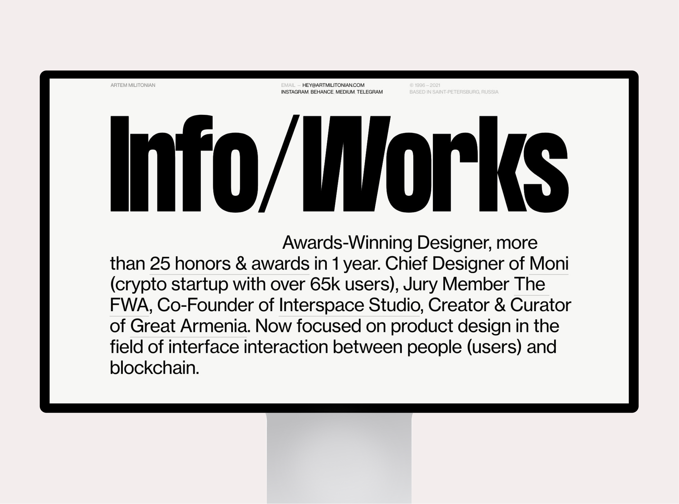
Here in this example we can see how Artem uses Size, Weights and Transforms to great effect in his portfolio.
By utilising different transforms at the right time we can further differentiate different forms of text. For lead in paragraphs we can use small caps. For a stylistic choice we can use big sizing and scale and further emphasise that with uppercase letterforms. The nuances of text transforms creates an extra array of possibilities using type.
04. Color
When you think of contrast this is what usually comes to mind first, and for good reason.
- Color contrast can allow our text to be accessible.
- Color contrast can express more of what we want to convey.
- Color contrast can also help us be invisible with our typography.
So let's take a look at some methods and ideas I use to create contrast with colors.

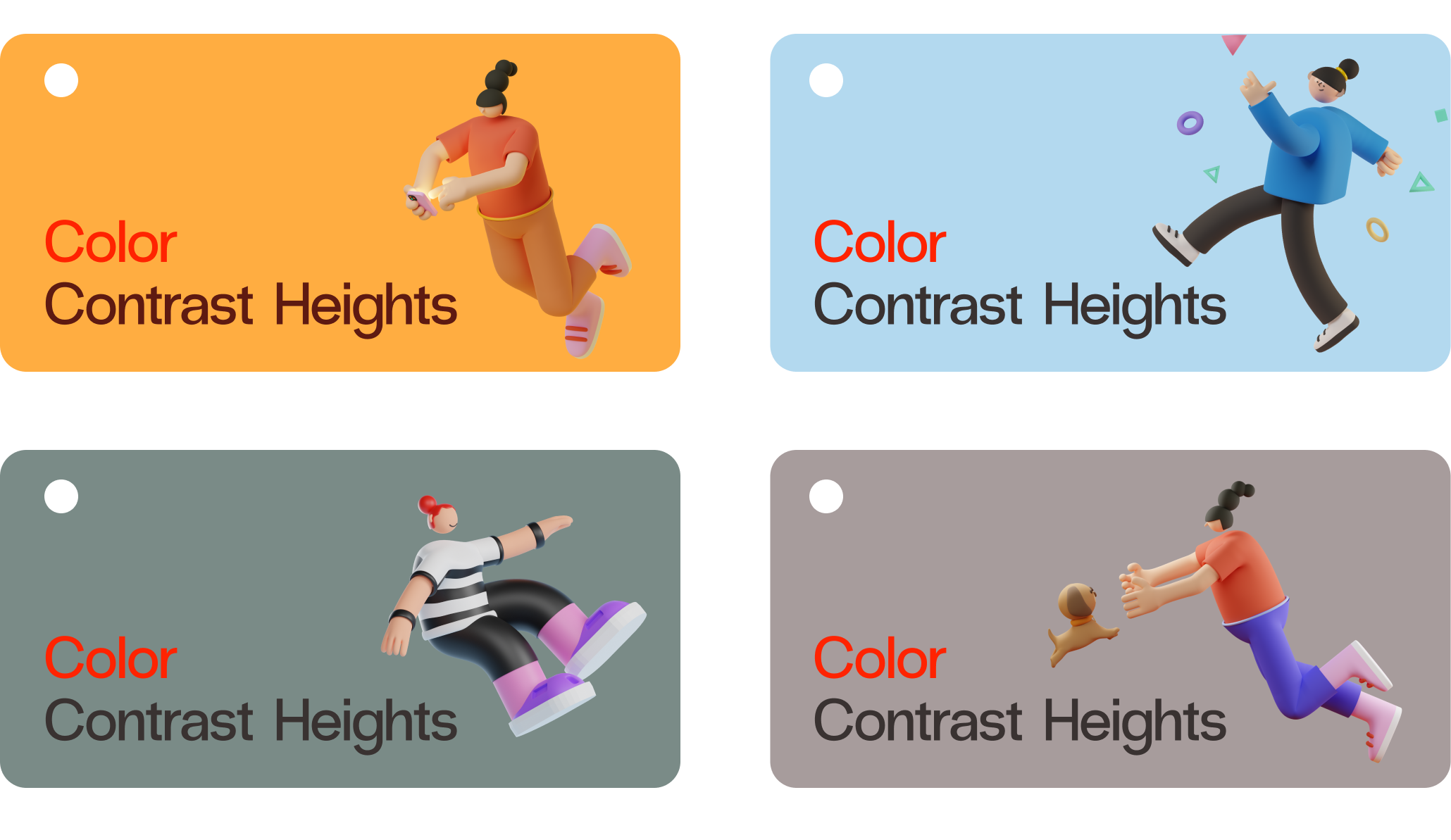
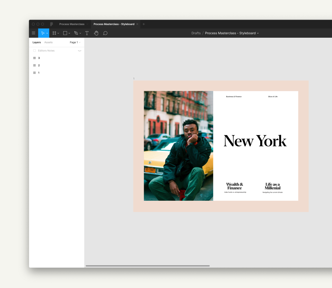
The first concept is the use of tones, to create contrast and hierarchy. Consider the above example.
When you want to create contrast with a headline and a sub-headline you can use it by pairing a darker tone with a slightly lighter tone. In this case it is black with light grey. Darker tones/colors have more contrast and focus than lighter tones/colors when on a light background. So in this case ‘New York’ is primary and more dominant vs. ‘Subway Design System’ which is secondary.
I use this color contrast to prioritise information to the user, even if the size and weights are all the same. You can do this with all sorts of type. Like body copy being a lighter tone. Captions being a lighter tone etc. This is a super simple concept that I'm sure you probably use already. But to actualise it through the lens of contrast - you can begin to understand better why it works.

Now the contrast ratio changes when we have a dark background. The inverse is true. If you want to emphasise something on a dark background use a light tone to gain more priority and emphasis. Take a look at the above example. White is now primary and grey is secondary.
This idea of tones and contrast is important when we pair type with different imagery and backgrounds as well. Dark backgrounds vs Light backgrounds. Knowing when to use light and dark with our typopgrahy.
☞ Tip: A good way to see what is dominant is to blur your eyes and look at the work. What letter forms strike you the most, and where is your eye drawn to when you blur your eyes.
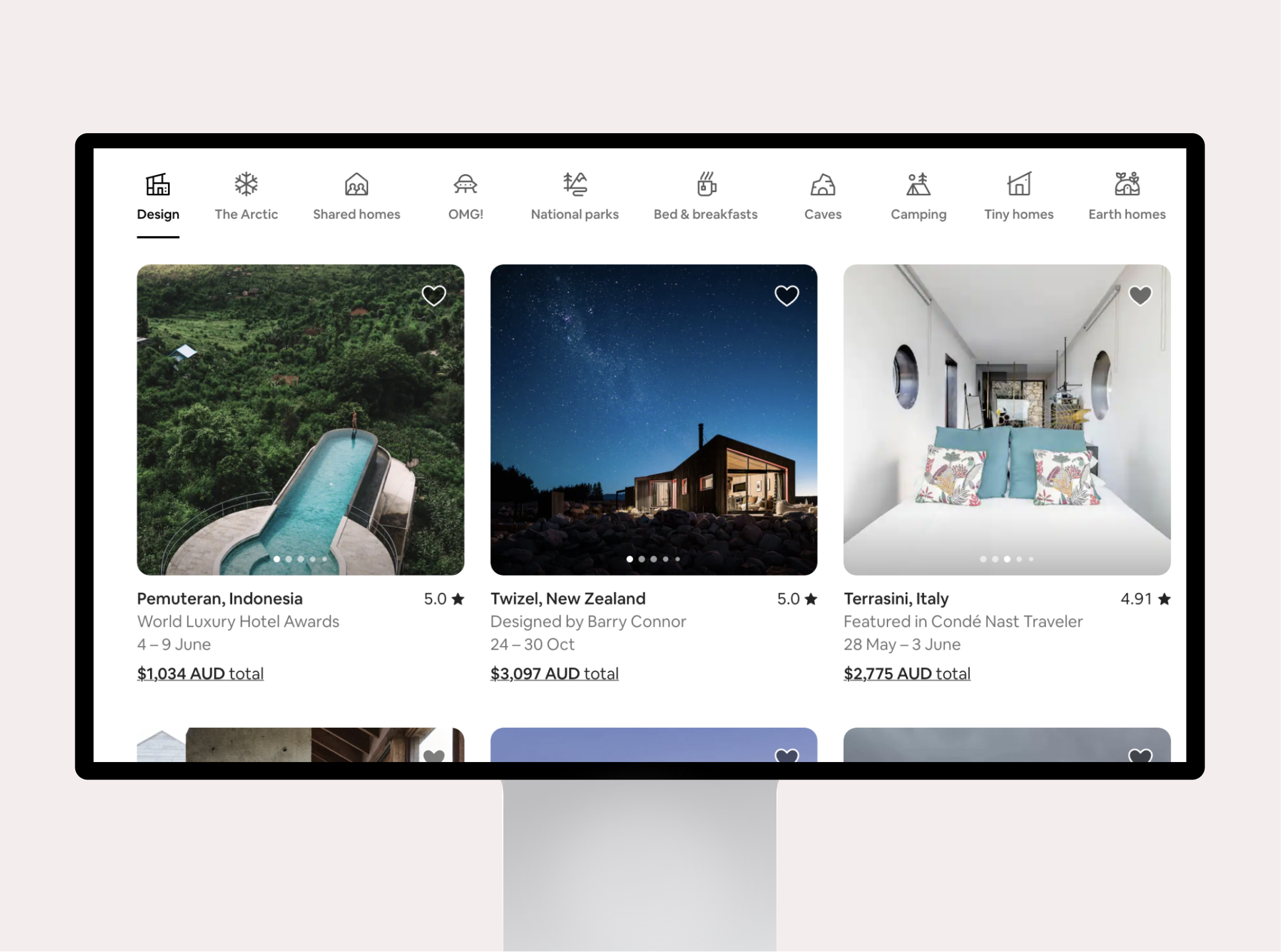
Here in this example on the airbnb website we can see the use of tones to create emphasis. Design is the selected state hence darker. Each location title Twizel, New Zealand has a darker tone and thicker font weight vs. the descriptions – Designed by Barry Connor. Use tone contrast when you want to emphasise or de-emphasise information. It's one of the oldest tricks in the book.
Tones, Color and Accessibility
You should also think about tones and colors when designing accessible sites and apps. You can use WebAim:Contrast checker to see if you typography is WCAG AA or WCAG AAA compliant. There are many plugins in figma to help you with this. Check out the article to learn more on how to create inclusive and compliant apps and sites. I did this a lot when I was doing design work for the Australan Government and for News apps I designed.
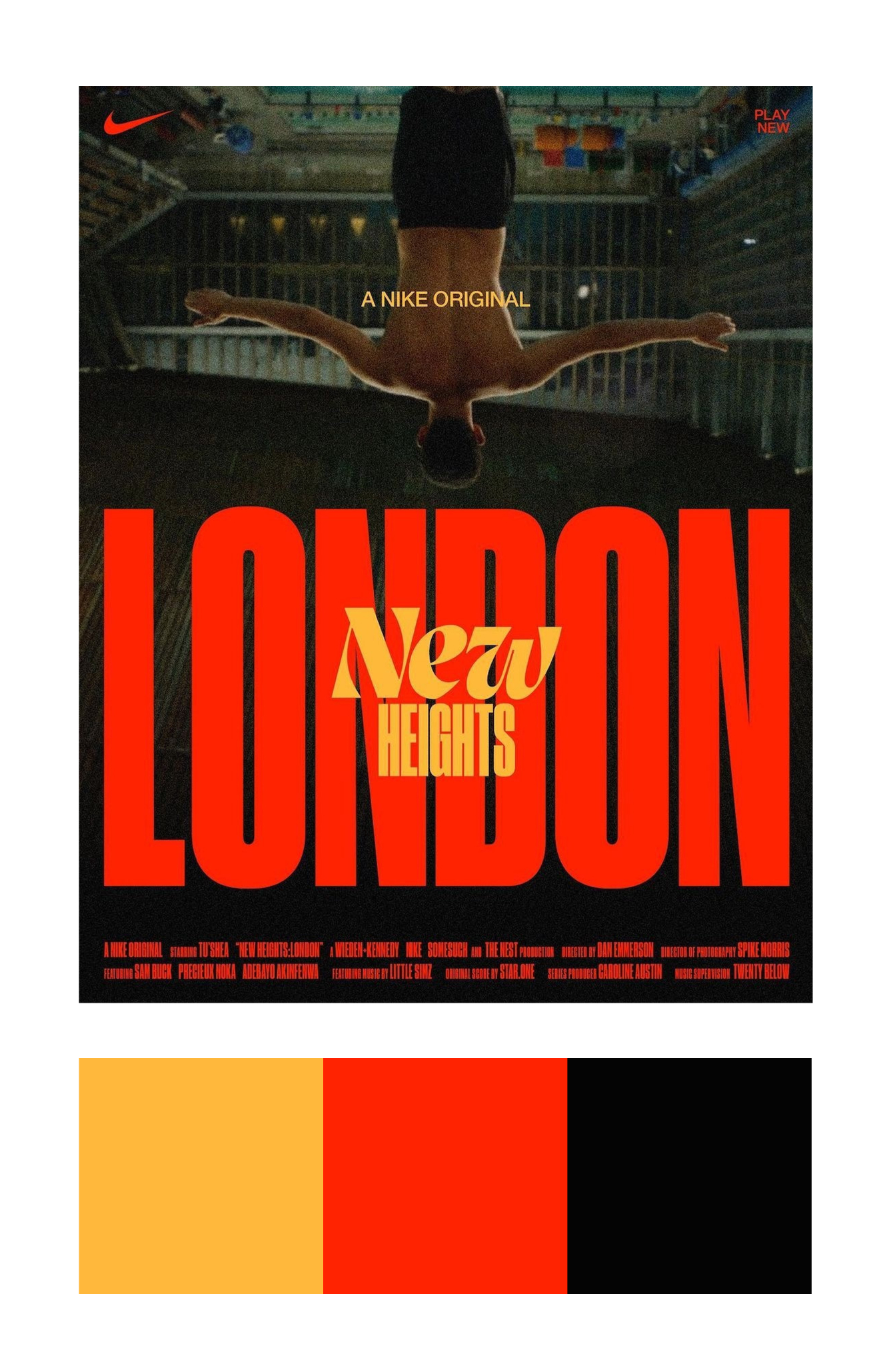
© NIKE - AARON SKIPPER
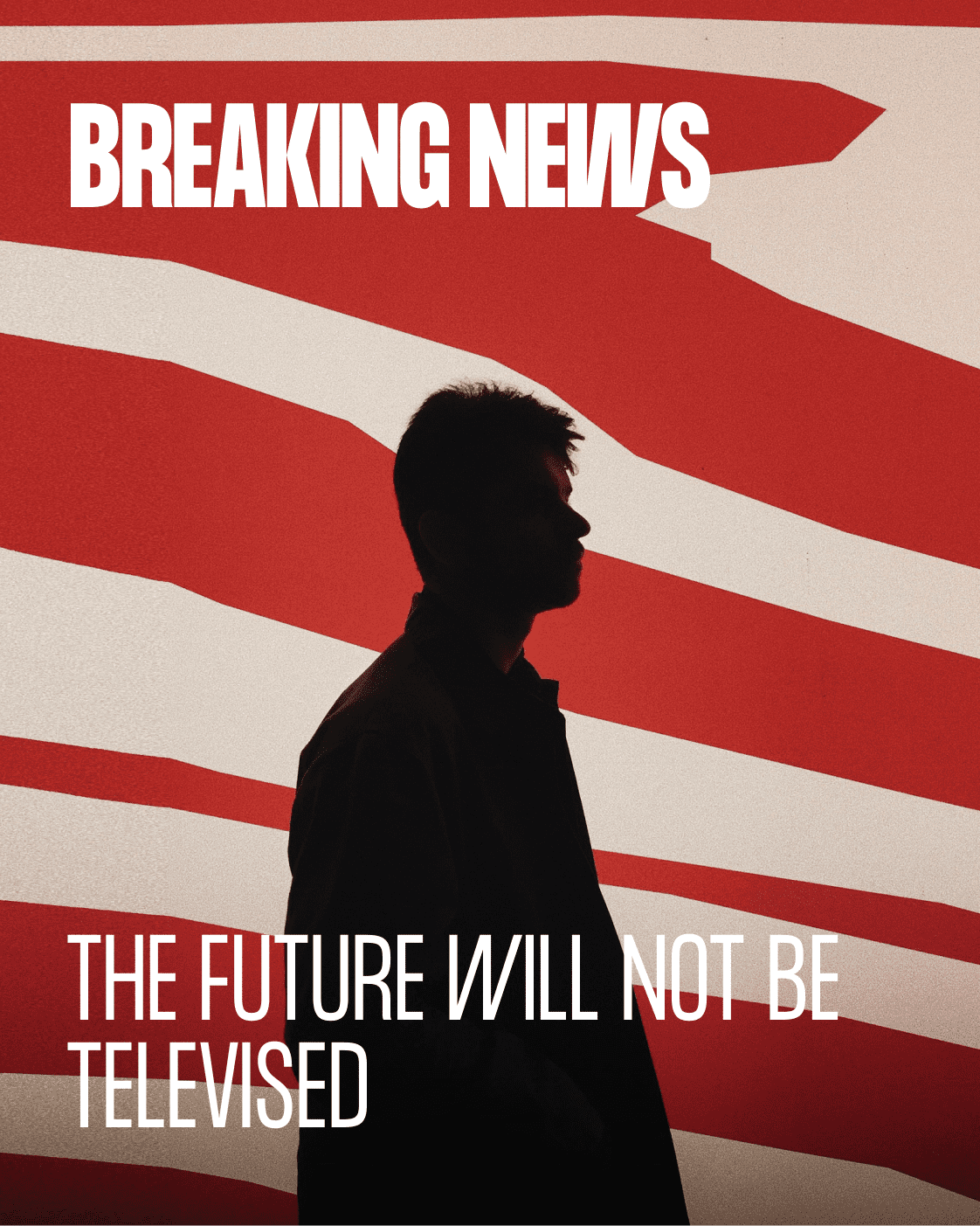
Next we have the use of a color palette to create contrast and intrigue. You can grab color combinations from posters, photographs, music videos (kpop is great for this), movies, or even sites/apps that you admire.
Here in this Nike poster example you can see how they create layers of type using colors, tones and contrast. Black in the background, red/orange on the mid-ground and deep mustard yellow right in the foreground. There's an optical hierarchy derived from this color palette. Going from dark to light. Dark being in the background and light being the foreground.
On it's own the poster has a specific mood about it. But when you extrapolate the colour palette it is a slight color variation of the german flag (Yep mind blown ? ) Color combinations are everywhere - you just have to keep a library and try different palettes.
Here in this example I play around with color palettes and contrast. The type has the same colors but given the background and 3d illustrations, we can create different contrast levels and sets with this art direction.
Below is a moodboard of some color examples that I keep for inspiration. One of the best things you can do to improve your visual design is to keep a moodboard of work that inspires you. I keep color combinations like these that I can refer back to when working on client projects.
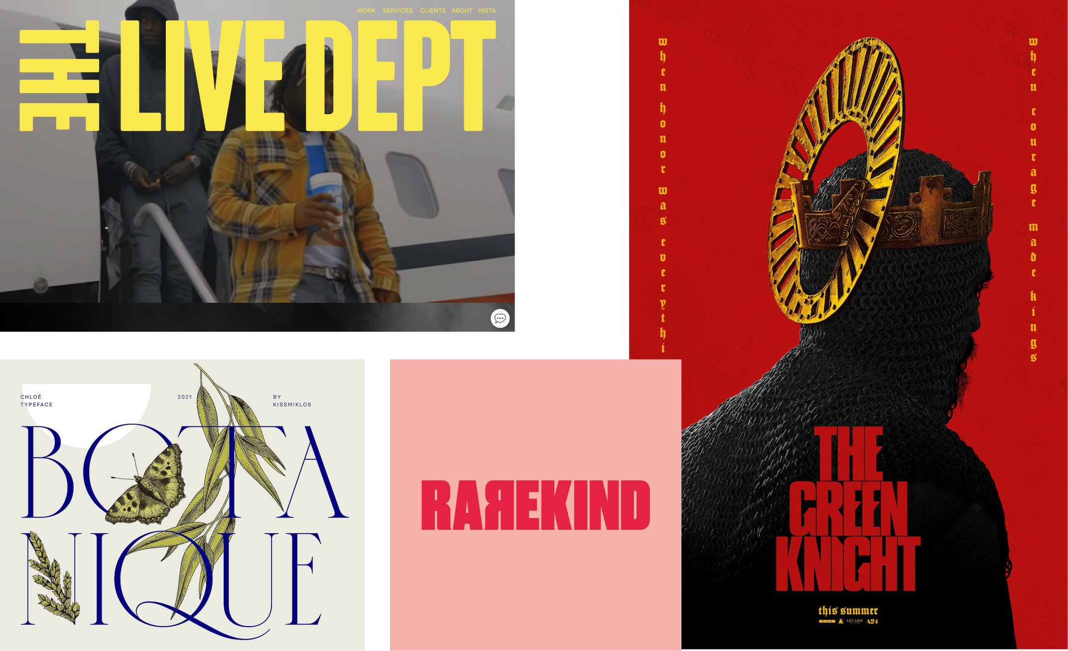
References: The Live Dept, Rarekind, Chloe Typeface, The Green Knight
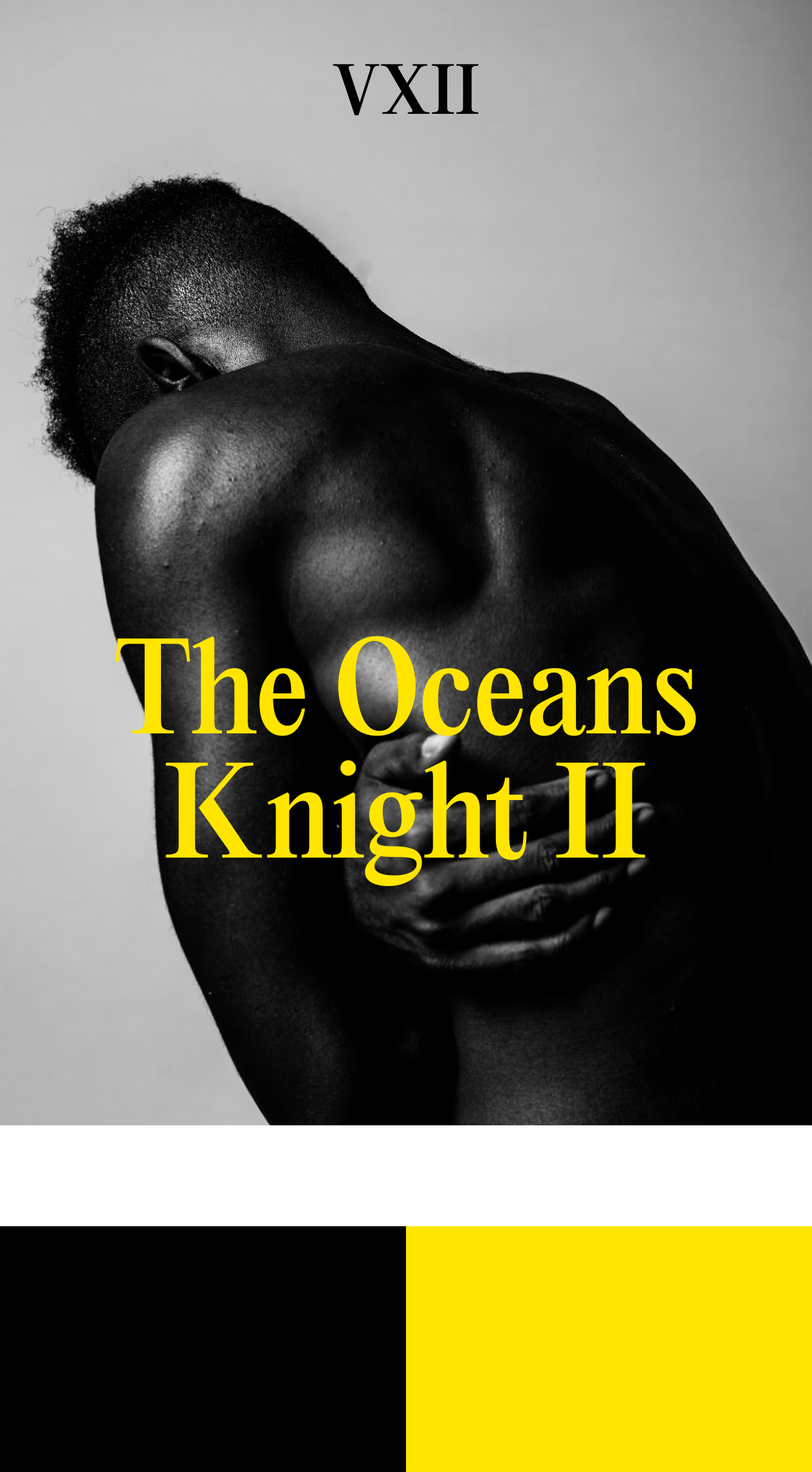
Striking dark tone backgrounds with bright colors
Similar to the Green Knight poster this uses the same principles. Using a dark tone background and contrasting it with bright color type on top. Contrasting bright colored type with dark background tones. Here I've used yellow but it works with any bright color that creates a striking contrast with the background.
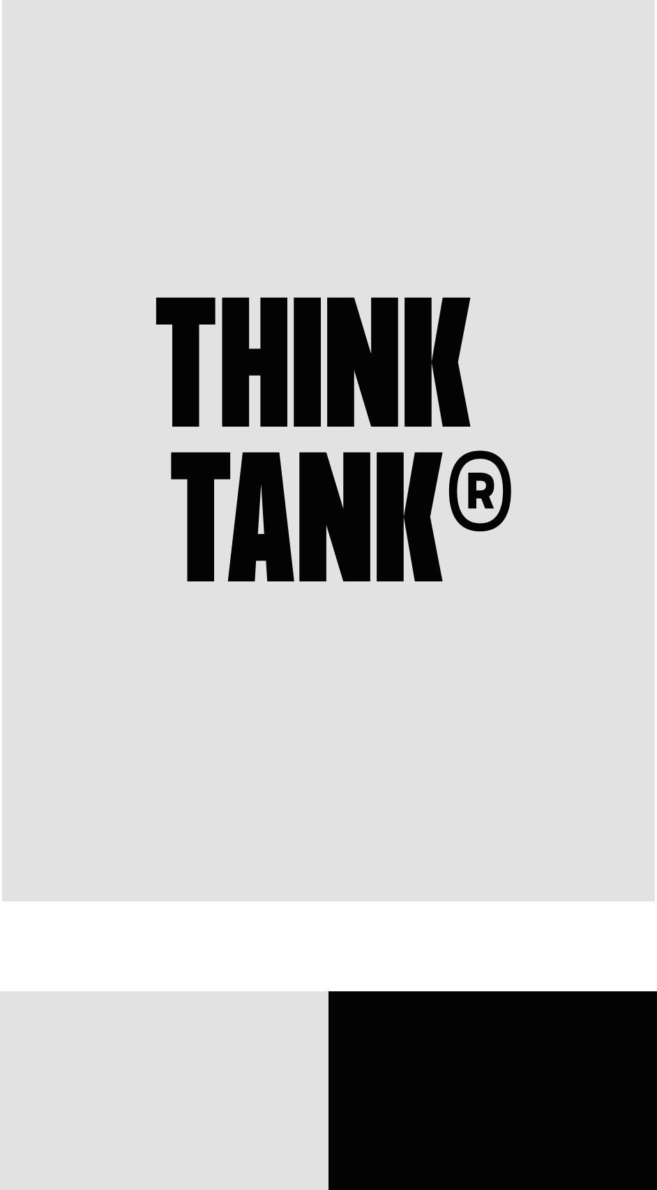
One dominant color and one lighter derivative color as a background
The other method similar to the Rarekind Logo. Is to use one dominant color in this case orange, and to use the background as a lighter color variation of the dominant color - in this case a pastel orange/cream. Try this with different combination colors and sets.
Gradients
Finally there are gradient colors. Which we can use for type as well. Which companies like Stripe have popularised. I tend to opt for Gradient colors as backgrounds and then opt for solid colors of type. But feel free to experiment here. Thinking about contrast and colors there are many possibilities.
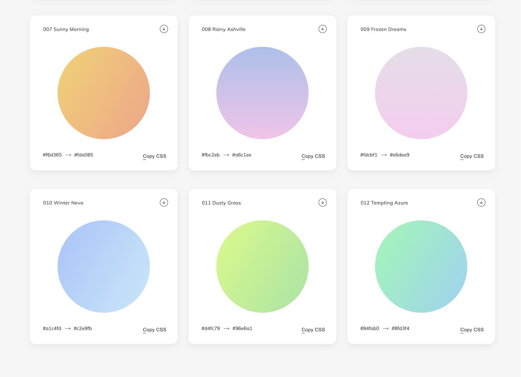
Color Tools
Finally these are some color tools that I recommend to get you thinking about different combinations you can use for type and contrast.
05. Typographic Styles
Different font styles can create different emphasis and contrast effects. So let's look at different font styles and their applications.

When we think of font styles - we have roman, italics, bold and obliques which I like to joke are counterfeit italics.
☞ Fun Fact: Obliques don't actually have their own character set like italics - but instead use the letter forms of roman and then slightly distorted and angled to the right.
Ok I'm sure 99.99% of you know about font styles already. So I won't bore you further with the design nerd talk. So let's skip ahead and learn how we can actually use font styles to great effect. We know about font styles but how can we use them to create contrast well?

When creating contrast and visual interest for headlines. An interesting application is to mix italics with uppercase transforms. Above is an example with the font Migra. This creates an interesting stylistic choice and contrast in the type lock up composition. With the emphasis being on ‘KINGS GUARD’ while adding a stylistic contrast to ‘The’.
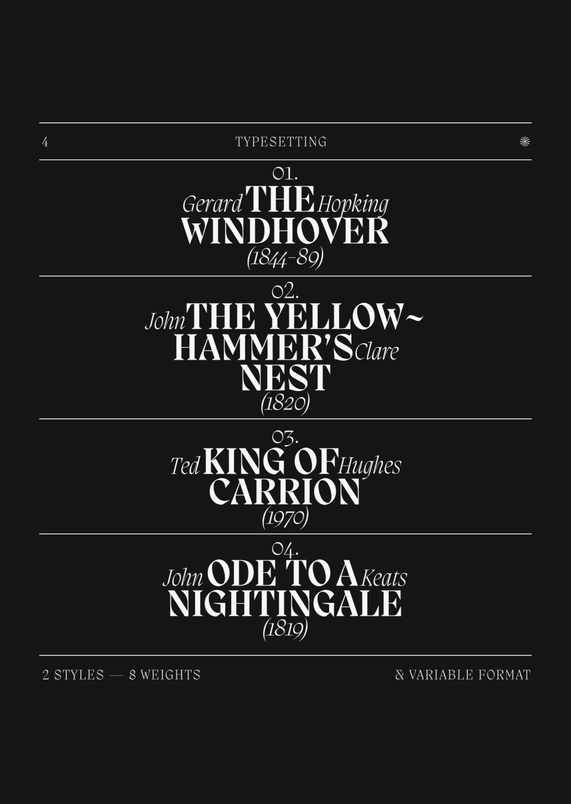
Here you can see an even more elaborate lockup using Migra. And the use of italics and font styles in unique positions to create interesting type lockups. When we think of Roman, Italics and Bold styles, it’s often that we can sometimes think of them too linearly.
In this example the dynamic stacking of the type makes for interesting intrigue, and dynamic contrast. Using italics and uppercase transforms as a combination is a great contrast creator that you use in your own work.
Now for UI/UX design this use case will be terrible for CMS systems that populate variable data - or a random strings of text. The lockups will seldom look like this when computer generated. But for marketing and custom work this is an interesting concept to play around with.
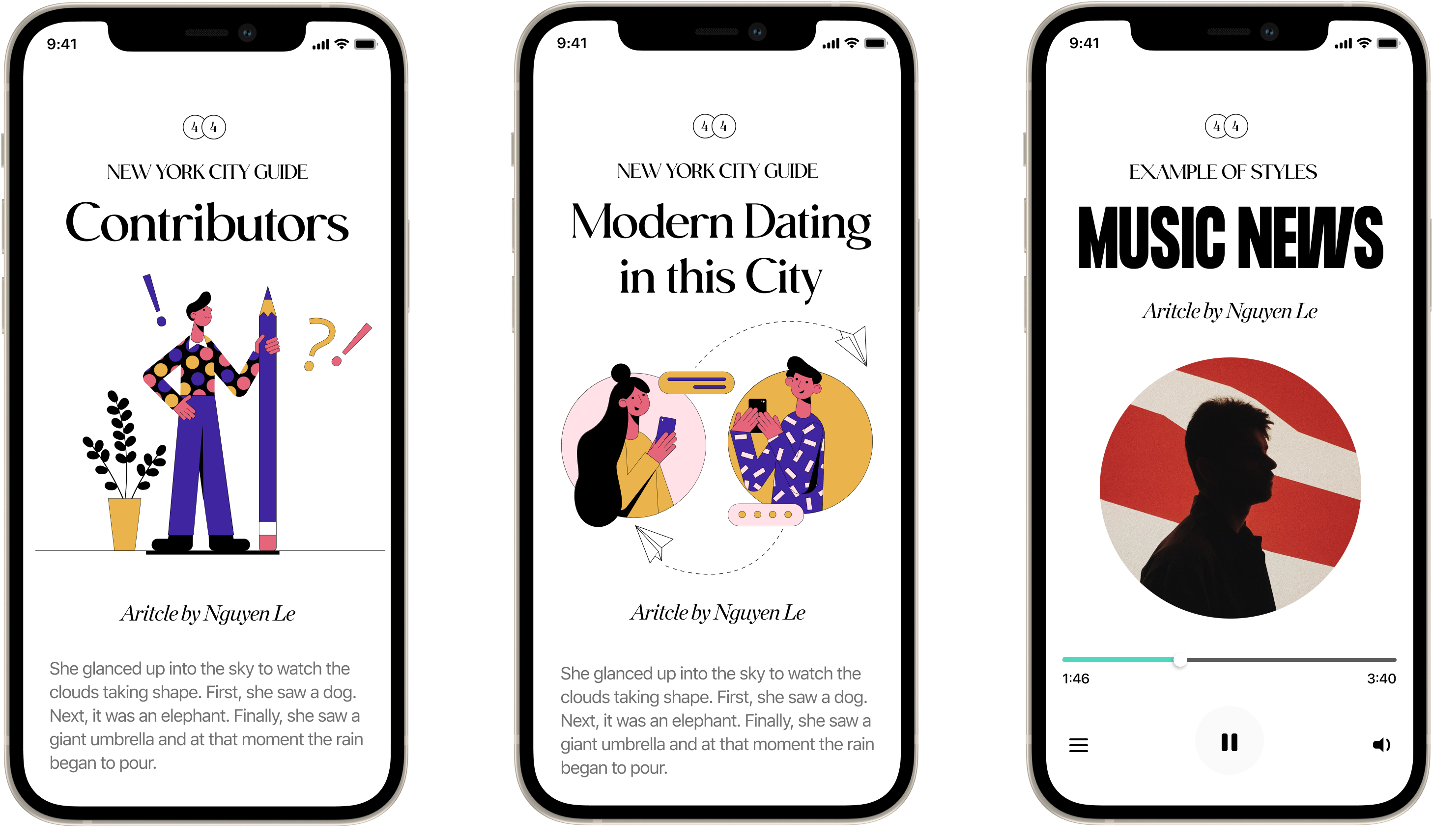
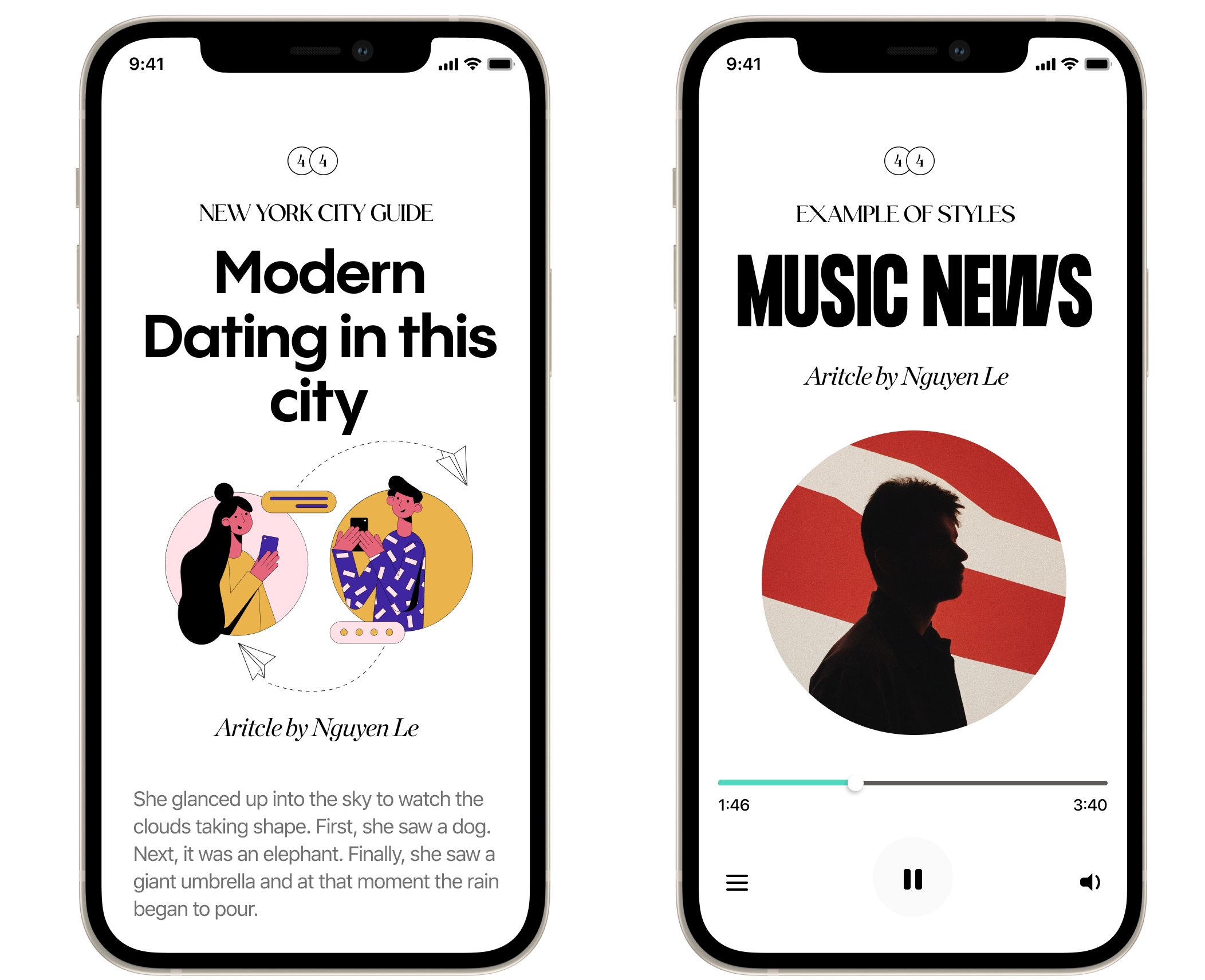
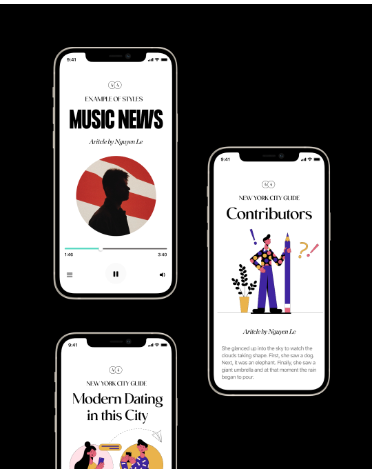
Mobile Design Examples
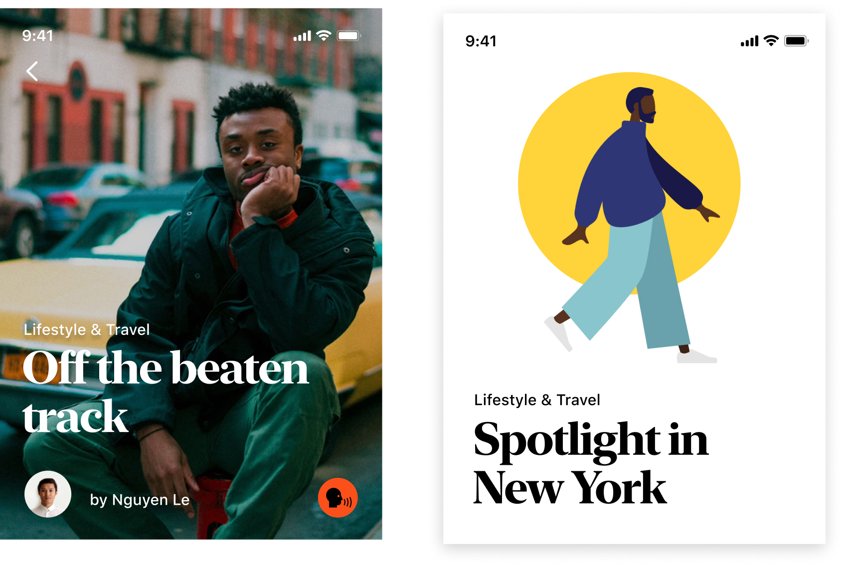
Here in some of my example designs you can see me use different typographic contrast creators. Different sizing, transfroms, roman titles and contrasting it with italics for Article by Nguyen Le.
We can use many contrasting techniques here. To either de-emphasize or emphasize various pieces of information to create harmony, consistency, style and readability. For Article by Nguyen Le I could've used a different color for example like a light grey to create a different contrast ratio. Or I could've used a light font weight and hierarchy for "author tags" in this mobile screen.
But instead I've used italics as a contrast creator which pairs with the rest of the typography in a much more interesting manner. It's simple, elegant, and super easy to implement. Hierarchically it works fantastic as well.
So how did I arrive at this? Through references and exposure from magazines like Monocle, and various books which have great type. And bringing those concepts to my digital work. It's a lot of trial and error. And that's what I want to emphasise - that these transforms and concepts require you to actually make things. Lot's of things for you to become proficient. A lof what you make will suck and that's okay. Amongst that pile of junk there will be gems and things you will be able to learn from and understand moving forward. Simple concepts done well, take practice to refine and get better at.
So many of the best designers learn by copying, creating and remixing.
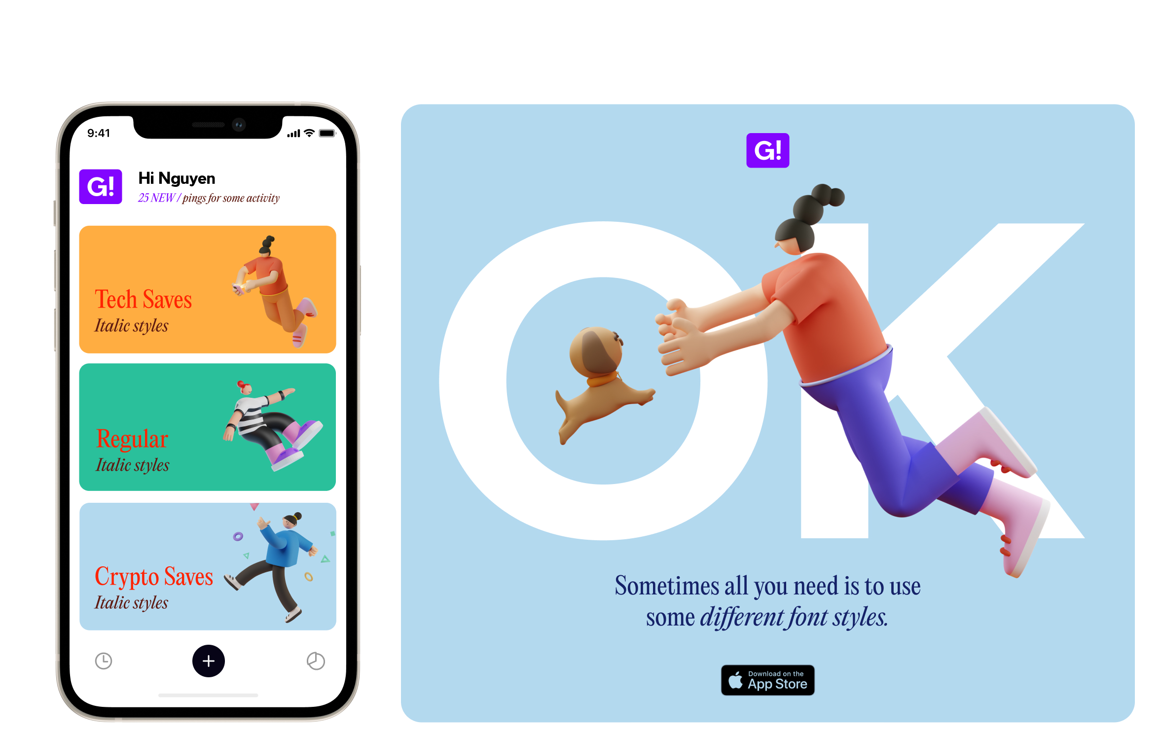
Using Italics
Here in this design of mine - we continue the use of italics in a different light. To create emphasis and to create contrast difference between a heading and a subtitle. I also used type as a decorative piece with OK being stacked in the background. The O creates perfect contrast spotlight on the dog and the K is leaning in the direction of the legs on the illustration. Type can also be used for decorative purposes.
Monocle Guide to Gentle Living
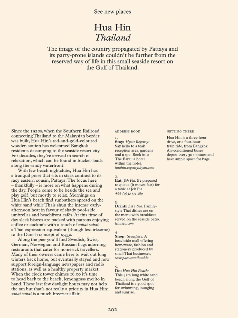
Here in this example we can see wonderful contrast, and meaning being created just by the use of transforms and styles.
Notice the use of font-variants in the use of small caps for ADDRESS BOOK. The X height of the capital letters lines up perfectly with the X height of the opening sentence Since the 1920's.
If you can make input data - or plain text clear, well contrasted and differentiated whilst aesthetic in a myriad of ways, it shows that you have a strong command of type and know how to use contrast well. Find some raw input data, paragraphs, or text and try to work only with type to create layouts. It's a great way to learn to get better.
06. Font Types

You're a designer - you know about fonts. But what about the use and mixing of different font types?
Here we have:
- Sans Serif - Radio Grotesk
- Serif - Moneta
- Display - Il Balfron
- Monospaced - Supply Mono
Some people classify scripts as well. You know those hand writing and cursive fonts. But since I use those mainly for decorative purposes I don't normally classify it. Different font types and typefaces have different contrast ratios and characteristics.
- When do you use taller fonts?
- When do you use Sans serifs or Serifs?
- Or Monospaced fonts. Or Display fonts?
There is one tip I will tell you that will solve your all typography pairing needs. Here it is....drum roll....
Good things take time and practice to fulfil and master. It's all trial and error and there isn't one rule that works for everything. I gave you the cop out answer but unfortunately it takes time to develop a keen eye for things. It's not a popular answer but it's a truthful one.
However when it comes to contrast here are some things that you can consider though:
- Mixing serif with sans serif typefaces can create interesting contrast effects
- Display typefaces are meant to be for large text only and doesn't contrast well for long form body text for example.
- Playing around with tracking and leading can create interesting aesthetic results and outcome.
- Create your own type combinations by referencing what others have done. Try to break down why it works.
- Monospaced fonts are great when you want to line up text vertically and horizontally, like for numbers, tables, or code.
- Save and create a typography inspiration moodboard somehwere. Pinterest, Dribbble, Instagram, Savee, or what I use which is mymind.
Here I've mixed serif with sans serif fonts. I have Tiempos (Serif) as a heavy headline font - and using smaller sizing with SF Pro text (San serif) as the category caption. The areas of light and shade and size, create ease of reading for the user.
Here's an interesting type lockup - using serif italics and a tight tracked sans serif font. It's that combination again.
Experimenting with different Font Styles
Finally similar to font styles. Here I've just displayed how you can use various font types to create different contrast levels and harmony. Modern dating in this city headline has been switched out from the previous serif version - and gives a different feeling. Some projects you will have defined fonts and sizing. So you can play with other contrast controllers. For projects with undefined fonts - try to create a lot variations to stretch your typographic muscle.
And that's it.
Remember just because you have a lot at your disposal sometimes less is more. It's good to know a lot and try different things. But the more you expand your scope - sometimes restraint is the most powerful contrast creator. When it comes to design this is what we should think about. What do we want users to easily understand? Who are the users we are serving and designing for? What are the business goals and desired outcomes? Why are we doing this? Then we use our craft and expertise to create and design solutions.
There is more I hope to explain in future volumes and they are outlined below.
Consistency
- Attributes, grids and representation
- Titles, Subtitles, Paragraphs, Captions, Links, Buttons
Intention
- What experience are you creating? Utility driven or experiential or both?
Legibility & Accessibility
- Sizing, screen adaptability, color contrasts, user testing
Font combinations
- Serif, Sans serif, Display
Working with constraints
- Fixed fonts - what you can still do? What is the design system or brand guideline?
Inspiration and type library
- What from my inspiration library is relevant? Can I use interesting glyphs? What font foundries should I check out? I use mymind to save a board on typogrpaphy.
Work, experiment, copy, recall and individualise. I hope you got a small amount of value from this first Volume. I'm truly grateful and honoured for you to read it. It takes a long time to compile a resource like this so I truly hope this has been some food for thought when it comes to typography and using and controlling type. Good luck on your journey.
Want more?
If you are interested I teach this and more in my design class Process Masterclass. You can also check out my free typography playbook for UI/UX designers.
You might also like:
Enjoyed this article? We've got more


FREELANCE / FEATURE
Learn how I made over $100k in my first year of freelancing, and the key lessons to help you do the same.

CAREER / FEATURE
Thinking about going freelance or running your own indie business one day? I share some of the very lessons that got me to 6-7 figures.
DESIGN TIPS / FEATURE
Build a solid foundation with this typography series as I share my ins and outs for using type in digital design.
UX DESIGN / FEATURE
A guide on how to approach UX design simply without over complicating things. This is my simple approach to user-centric design.
SOME OF OUR MOST POPULAR POSTS

Resources and freebies
Vespi Figma Project file
Here's a preview of the class project files in Figma. You can see how everything is setup - using grids, components, typography and creating a design system. You can duplicate this and have a play around.
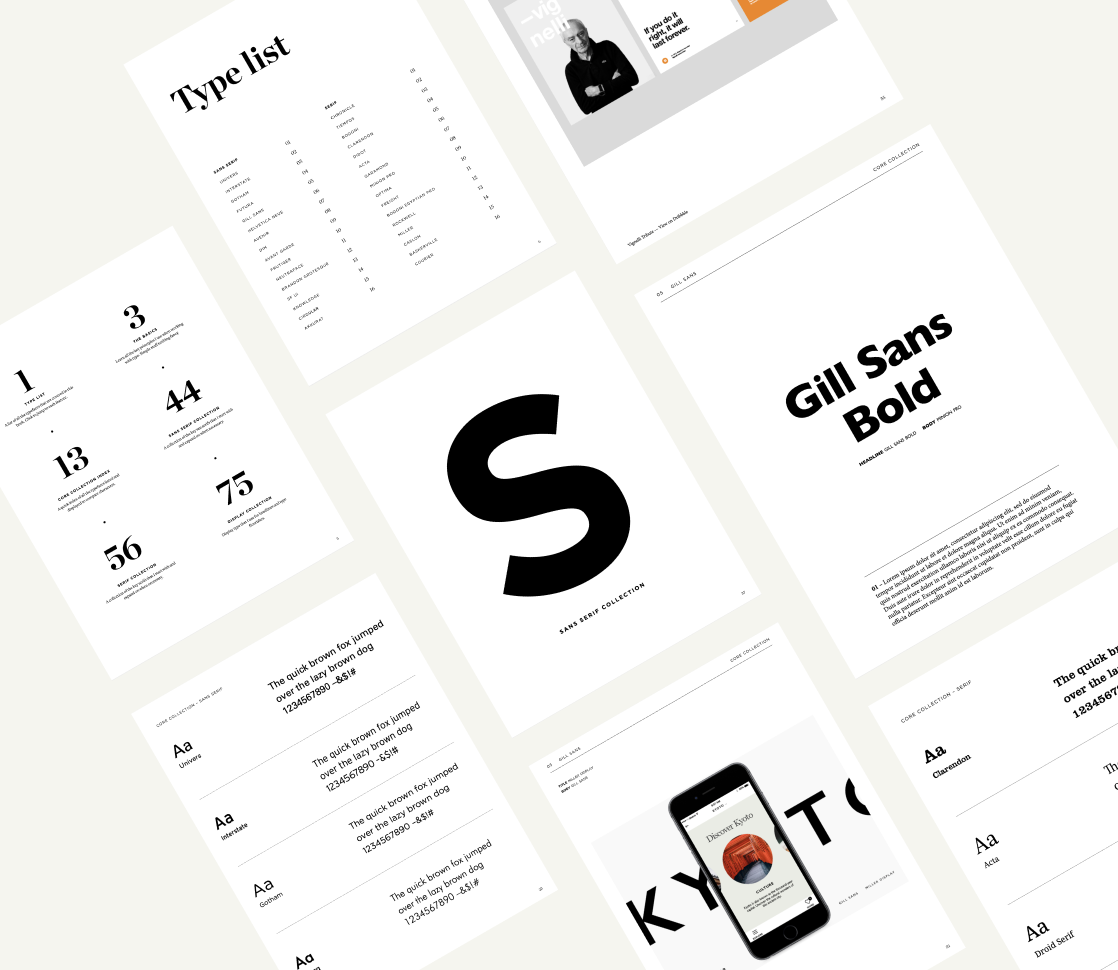
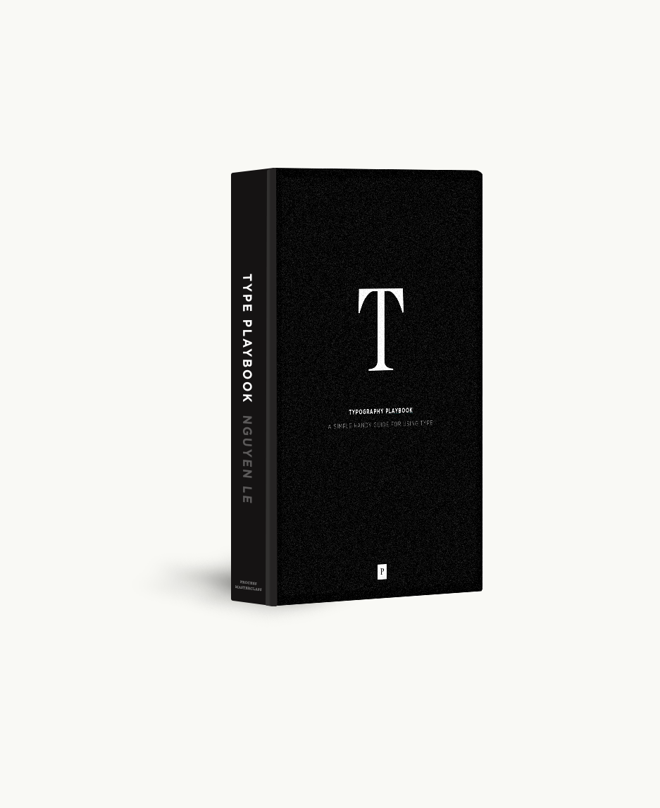
Grab our Type Playbook
A collection of typefaces, foundries, typography tips and more in this free eBook. Made for digital UI/UX designers looking to learn more about typography. Condensing 10+ years of experience into this resource.
Styleboard Figma Template
Use styleboards to work with clients to flesh out the initial art direction. To get a feel for how a project could look and feel. They are a quick and effective to way to communicate the art direction without sinking too much time.
LEARN A SOLID DESIGN PROCESS
Increase your value as a UI/UX designer. Learn design thinking and design execution in this comprehensive online masterclass. Great for self taught designers, or those with 1-3 years experience looking to take the next step in their careers.
Join the community
Enjoyed the articles here? Join my personal weekly newsletter about design, business, life and things I'm working on. Sharing 15+ years of design experience, and everything in between. To help increase your value as a designer. Join 20,564 designers.
Unsubscribe anytime. You're in good company, read by designers who have worked at Apple, Adidas, Google, Pitch, Facebook, Slack, Instrument, Work&Co.