Currently sitting at my desk - the time is 3:32pm. Been hammering away at a project in Figma - and it dawns on me. I'm currently setting up a component library - renaming layers and setting up the design system. And I think to myself hmm... I can probably be doing something else - organising and renaming layers is a necessary evil, but boring as shit at this point in time. And since I'm my own boss I don't really have to do this if I don't want to.
So the multiple choice pops up in my head. I can:
a) Continue what I'm doing
b) Go to YouTube - watch some tennis videos and go down that rabbit hole
c) Write a case study and share some cool things with you. Do something productive whilst procrastinating.
Pondering for all but 2 seconds I decide to go for c).
So here we are...
What you'll learn in this case study and Part 1 is:
- How to preface your design with the right questions
- How to be a valuable designer
- Terminology and an approach for design for SaaS products and tech companies
- The way I think and approach design
It's been a while since I've written one of these so I will try to jam pack it with what I know. Along with stupid memes thrown in - because hey why not. This can be both informational, valuable and hopefully amusing.
Cue the intro elevator music as we step through the project...
This is Crypto the project we'll run through. Where I will teach you some key ideas from my design process which you can use. Not only are we going to look at the product design itself, but also how to build a case study and narrative around the whole product. Great for presenting to stakeholders or if you are working on a case study for your portfolio. We'll start from the design thinking side of things all the way to execution.
For Process Masterclass class students you have full access to these working files under My Lessons 🙂
So what is it?
Crypto is an app/digital wallet that streamlines cash and cryptocurrency seamlessly not just as a store of value but used as a transactional wallet. It is based on the coinbase app, paypal and the cash app.
The value proposition
It's value proposition is that it streamlines cryptocurrency payments, withdrawals and transactions seamlessly. Converting to cash conversions on the fly based on market values. Unlike other wallets it's meant to be used as a utility tool for payments first and foremost, and an investing tool secondarily.
Now there are varying stages for a product like this.
- Minimum Viable Product phase AKA MVP (What is the market demand for this and is there business viability?)
A super grass roots version of the product - released into the market to see if there is demand for something like this. We slowly listen to customer feedback, waitlist signups, look at revenue numbers, and growth rate and continue to iterate and evolve the product. - Product Market Fit (Scaling, improving features and tech stack)
At this stage - there's traction. Your product fits a market need and there is demand for it. If your product would leave the market it would be missed.
Think of it as having medicine - it's a MUST HAVE item. If you are sick you need medicine. It's not just a supplement - it's something essential.
This product now serves and solves a very specific paint point or need. This is where we get scale and network effects. The more people that use the product the more valuable it becomes as it creates it's own ecosystem. Think Meta, Slack and Apple.
At this stage there is sometimes capital injection from investors for growth - or you can be bootstrapped, which means there no outside investors and everything is funded yourself and on profits.
This is where design sprints and continuous iterations and improvements are done for the product. And also where marketing spend and customer acquisition increases.
- Product Innovation (How to compete with competitors and continually gain market share)
If there is a market - there will be competitors. Once you've found a profitable section of the market - it's easy for competitors to come in and copy exactly what you've done. You've done the research and validated the market. This happens all the time with copy-cats and me toos.
Think about how Threads aka Meta blatantly copied X and how their Instagram stories was also a clone of Snapchat and many of it's winning concepts. Stealing a big number of their user base.
So you have to have a point of difference - is it your brand, your product, the ecosystem you've created, or your superior design or tech stack?
They call this a Moat. Something to surround your castle to keep it safe. In this case it is something to surround a business to keep it safe from competitors.
From here you need to innovate - explore new verticals - create and design things that can't easily be copied. Listen to customer feedback and work on design sprints and improvements. The product design never stops, it's a continuous journey.
These are the 3 main business stages that we focus on.
For this project we are in the early Product Market Fit stage. We have a solid product that has traction in the marketplace but we are continually improving it – based on user behaviour, growth rate and user feedback. So we will look at how to iterate an existing product like this and the design process we'd take and use to improve it.
When I start a project it starts with the 10,000 ft view. It's how I approach things as a Creative Director back in the day and it's a habit I still keep with me today.
Getting Meta
Now the purpose of Crypto serves as a case study to teach students of the Process Masterclass how to approach app design, create a visual identity and how to design holistically –thinking things through from A-Z and how to execute based on that.
Whilst the app is a hypothetical project I cover things in depth the same way I would approach paid client projects. Projects that cost tens of thousands to hundreds of thousands of dollars throughout my career. Funded startups, ecommerce projects, household brands, government projects and all that jazz.
Projects that have gone on to generate millions of dollars in value.
I will also show you how my process from a thinking point view all the way to design execution.
So let's jump in or in this case let's fly up.
The 10,000 ft view
Projects should start with a 10,000 ft view. And what that means is before you get into the details of a project. Fonts, colors, design software, interactions etc. You should have an understanding of the big picture.
What is the purpose of this project at a high level?
What is it trying to solve and achieve?
What would success look like once we complete the work?
Simple, but it's this holistic approach that will help you create more effective work.
Also when you are intentional about what you do - it will help you communicate better.
You want to get paid and be valued as a designer?
Make 6 figures, do good work, be respected and all that jazz. Where clients and employers happily throw big money at you. Well that starts with the 10,000 ft view.
To be valuable you must deliver and create more value than you are paid.
It's simple math - if you can generate $5,000,000 worth of value it will be easy to see why you would be worth $250,000. The return on investment is worthwhile for both parties.
When you buy something or use a service. There is an exchange in value. You buy a pair of Nikes because it's worth $120 to you. The materials may cost less but the value is worth it. Business is the same way.
Drive, deliver and create value and you will valuable.
Of course you're thinking that's easy to say Nguyen.
But the question is how?
It's about creating results and win/win situations. Where clients trust your expertise and the results you can achieve.
Based on your experience, past work, past clients, past results and your process.
What you and your team create will be beneficial to them and their business. And one day should you desire you can run your own business and create results for yourself instead of someone else.
If you don't feel confident yet on how to create results, keep practicing, keep learning and keep working.
Nothing worth doing comes easy, but have patience and determination and you will be rewarded for your efforts. It's about taking small steps one day at a time. And then one do you like back and realised you've walking hundreds of kilometres. You'll get better.
I had no idea what I was doing when it came to this stuff at the start of my career.
But over time you learn and grow confidence based on small wins and losses (painful but needed learning experiences) over time.
So what is this 10,000 ft view? In short it's the big picture.
This is my playbook. Every project starts with these high level questions. It's why CEO's get paid the most, VPs, Design Managers etc. It's about steering the ship at a high level because these decisions will build the biggest results in the market place.
Even if you are not there yet, if you are a designer with some experience only, or aren't confident yet - just having awareness of these questions will give your work a sense of direction and purpose.
It's not merely - this interaction looks cool for dribbble that's why I did it. Or I have a hunch that this works. Or blue looks cool for this button.
It needs to be more intentional and clearer than that. And these objectives will give you a clear reason for why you do what you do. Because why is important.
These are the main considerations you should have:
1.What are the business objectives for this project? (Some common examples)
- Increase revenue by 15% for the quarter
- Improve user retention on the app
- Improve the lead to customer conversion rate by 20%
- Improve the user experience of the app to boost customer satisfaction, word of mouth referrals and our Net Promoter Score
- We want to drive new user accounts and collect more email address - 10,000 emails for the quarter
You create value for businesses by driving these metrics forward. You may think isn't this the responsibility of the sales team, marketing department or some other team when it comes to the "business" side of things?
We will touch on this below when we talk about building and facilitating "cross-functional" teams. But working towards clear objectives gives weight to what we do. Clients will have objectives, uncover what they are. Ask the big why questions or ask somebody who knows.
2. What are the user objectives? What do users want to achieve?(Some common examples)
- As a consumer (Jess persona) I want to be able to check my crypto balance easily
- As a casual user (Naval persona) I want to be able to reliably send bitcoin to my friends wallet
- As a consumer (Jess persona) I want to be able to use my crypto card in place of cash instantly on occasion
- As a investor (Ashley persona) I want to buy multiple cryptocurrencies and easily
- As a casual user (Naval persona) I want to add my bank account
- As a casual user (Naval persona) I want to convert bitcoin to cash and add to my bank account within 1 hour.
You create value by solving these user needs. It comes back to creating medicine. Creating products that solve a particular problem that people will miss if they are gone.
We must delight and satisfy user needs in order to build loyalty, to not to get leapfrogged by competitors. And at a grassroots level give them a reason to use your product or service.
Now to solve user goals we have to understand who our users are. And that goes back to user insight and getting data. Who are our users and what are the jobs to be done? ← Watch this video to learn more about jobs to be done.
Now we have 2 main pillars for our design decisions.
What are the business objectives and what is the user objective? And how can I design to solve these needs?
Before you continue you can ask an even bigger question.
3. What is the ethical and social impact of this work?
With the scrutiny of big companies like Meta and creation of addiction in the products we create.
There are also the dangers of using design to mask lousy products that are made with no care and made only to flip a quick buck. Leaving customers out to dry. Do you want to work on something like this? That's up to you and your moral compass and current situation.
There are many social and ethical questions we have to ask ourselves throughout our career.
So you have to make an ethical judgement on what your values are. Because user centred design and just designing to make people happy is not enough. You have to think about the bigger implications. Ethical design is equally as important.
Once you have all this data and information you have a clear picture of the high level objectives- you are armed with the tools and forces to make smart design decisions.
Assembling the project team
When designing you will have to work with other people.
Researchers, developers, project managers, designers, marketers etc.
Remember when we said isn't the job of moving business metrics the responsibility of the sales or the marketing department?
Effective design is not done in a silo. Sure you can get beautiful visual design on your own. You can even do an MVP on your own. But good design is not just about the craft.
“No product is an island. A product is more than the product. It is a cohesive, integrated set of experiences. Think through all of the stages of a product or service – from initial intentions through final reflections, from first usage to help, service, and maintenance. Make them all work together seamlessly. That’s systems thinking.”
Don Norman
Particularly when we are driving business metrics and user objectives - collectively a team has to work together to create an extraordinary experience for the user.
How fast does this thing load? Affects the user experience. You need to work with developers/engineers on this.
Customer service representatives - represent the brand and affects the user experience.
How long did customers have to wait to get answers on an emergency? What are customer frustrated by?
You need to work with customer service representatives to understand users and these needs.
Marketing - how are we currently communicating and getting leads and customers? How can we design this better?
Those are just some examples.
All of these disciplines, create a brand experience, a user experience and effect the people we are trying to serve. Design is functional but also emotional.
“Products were once designed for the functions they performed. But when all companies can make products that perform their functions equally well, the distinctive advantage goes to those who provide pleasure and enjoyment while maintaining the power. If functions are equated with cognition, pleasure is equated with emotion; today we want products that appeal to both cognition and emotion.”
Don Norman
By consulting and working with every department you get a 360 point of view on how you can incorporate the needs and capabilities of each discipline and department. How can we actually design but also be facilitators? How to build bridges and communication between each discipline to create unified experience to hit our business objectives and user objectives?
What is the cross functional team?
A cross-functional team is a team in which the members have different skill sets, but are all working towards a common goal. The best case scenario is to create a cross functional project team which may consist of a PM, engineer, marketer, UX designer, visual designer, lead designer etc.
Rather than each department working in a silo. We work together cohesively.
This is the best case scenario - but even if you are a freelancer or can't build cross functional teams. You can still gather data and be a facilitator for each departments knowledge to come to the forefront of your design decisions in order to help achieve our objectives. Using everyones expertise to co-design.
Once you have this you are ready to go forth and design. Your overview from 10,000ft above gives you the compass you need to execute on where you want to go.
That was a long ride so we'll take a pit stop here. In Part 2 we will focus on the craft side of things. Which will hit your inbox tomorrow, sharing you tips and tricks on the craft and execution side of things.
Ok now we get into the fun part, for me at least.
It's the reason why many of us became designers in the first place.
We like to make things. Beyond being valuable or making money, it's about enjoying what you do. And if we are lucky enough by turning our work into play.
Think holistically - design beautifully.
Now that we have our business objectives, user objectives and ethical considerations. We can use these as our north star from time to time to guide us. But now we can get stuck in the details and start executing.
Consolidate points of views from each team member
Once we have our cross-functional team we can consolidate the view points of each team member.
Now armed with a bunch of data, a bunch of great people close to the problem and product, and clear goals and intentions in mind.
We get started.
Getting started - The blank canvas
So when we begin we stare at this blank canvas. There are many ways to skin a cat or approach our work to a desired end result. You can start with some mid-to-high-fidelity work and extrude your ideas from there.
Or you can start with a lo-fi approach, such as sketches, wireframes and build from there.
Despite what people say I've been on project teams where either approach can work. As long as the prototypes gets into the hands of users and clearly addresses their goals and needs. How we get there is merely a means to an end.
Design is not always linear. We do this, then this, then this. Things can happen concurrently and asynchronously.
Here is how you turn that blank screen into a set of ideas, designs, and prototypes that goes into development and into the hands of users and the market place. In turn creating value, through either utility, revenue, engagement and word of mouth promotion.
Think about user flows and epics
When we start we combine all the data and information we've acquired so far.
- What are the capabilities of the engineering team?
- What is our market positioning?
- What do users want to do?
- How can we service them?
And we do that by thinking of features and pages through the lens of the user. You do that through user epics and stories. I've written about that extensively here if you want to learn more. Read article
An example of a user epic. Naval is at home and wants to send $4500 USD worth of bitcoins to his business partners wallet. He's run out of cash on his business account and waiting for the outstanding business invoices to get paid for the month. He has yielded a good return on his bitcoin - so he is using the gains as extra capital into his business as a cash injection. His business partner Ash will then use that sum to setup their marketing budget for the month. She's planning their ad campaign at the moment.
Naval opens the Crypto app:
User stories
- Naval want's to be able to login in securely using FaceID on his phone.
- Naval want's to check his cryptocurrency balance
- Naval want's to know what the conversion of his cryptocurreny holdings are for different currencies like USD
- Naval wants to be able to transfer bitcoin to his business partner Ash
- Naval wants to be able to send Ash bitcoin/cash via her email
- Naval wants to be able to select the bitcoin from his list of crypto holdings
So you can see stories are essentially features looked at through the lens of the user. The above is just a sample of some user stories. You can end up with a lot.
So then we make meaning of these stories into a series of logical screens, user flows and interactions.
You can do wireframes or flows here or do hi-fidelity mock ups.
Leverage existing design patterns
When you have your user epics and flows. You can look for inspiration in products that solve that particular problem in the same industry or different industries. You leverage and try to improve what's out there.
You don't always have to reinvent the wheel for the sake of it.
- How can we serve users?
- And how can I serve users better?
- Sometimes it involves reinventing the wheel - but a lot of the time it doesn't.
- Leverage what's out there and make it better incrementally.
From a functional point Disney+ and Netflix have very similar mental models and design patterns. The difference is in the content, distribution and the tech stack that delivers these products/services.
Once we have the flows I look for visual design inspiration from various sources. Print media, Books, websites, apps etc. Keep your influences diverse. Then when it comes to interaction design and patterns.
I use Mobbin and look at onboarding and login design patterns. From similar apps like the cash app, coinbase and paypal. You can filter based on different sequences and screen types on the site.
Now I fill the Canvas with these reference screens.
You can also add other materials here - like typography inspiration, branding examples, interactions and graphic design. It can serve as a moodboard.
For the next parts I'm going to break them down into a series of bite sized sections so it's easier to digest.
Naming and setting up your file
I like to start by building a series of basic flows.
So what does the sequence of screens roughly need?
What does each screen need to convey to the user so they can achieve the task that they want to perform easily?
And which areas need more friction so user errors don't occur for irreversible actions. ie. Sending money to the wrong wallet etc.
Frictionless and easy is not always the goal. You have to think about the scenario and context too.
So think through these flows from the P.O.V of the user and business goals.
Example Screen. Send Currency User flow. Different key screens needed to create one key user flow. Once you have this you can group things together into Figma Sections, here I've sectioned it to Send Currency. You can see my structure below.
The key with naming and structure is to communicate clearly with the project team exactly how everything is setup. How you do that is up to you and your team - and how you can organise things effectively and efficiently.
This is how I like to do things so it's an idea for you to use.
Modular Design – thinking about flows and systems
Below you can see how I design reusable components - such as the navigation, typography, colours, and various fields. These sections and components derive from the business goals and what users want to achieve so we can create the building blocks needed to rapidly create new screens across many people working on the product.
Here Naval can check his balance easily.
Here I show you how I break down a full app so that the team can easily work on parts of it and digest each section. We break down the app into parts and flows.
You can see that Send currency is one flow or section of the app. Which has screens from 1.0 to 4.0. Any changes or updates to this flow can easily follow this naming convention. Break your app into understandable sections.
For this project the top level Information Architecture is -
Existing Users and New Users.
Then under that tree we have the branches - for Existing Users we have:
Login, Wallet, Send Currency, Withdraw Currency, Settings. And under each of these branches they all have their own flows.
For New Users we have:
Onboarding screens, and empty states for when there is nothing in the wallets.
From there we can systemise parts. Brand and Illustrations, GUI & Icons, Cards, Navigation & Modules, Typography Variables/Styles, Colors, Effects.
Modularity creates efficiency and speed to market. But in the early stages it can be also a bottleneck. Overengineering your design files can slow you down. But being sloppy with many designers and engineers shipping will create problems and technical debt. You have to know which stage you are in, and act accordingly with you and your team.
Prototyping
As we are building these screens we can begin to prototype and test on native devices, to see how things flow together. And eventually to let users test them and get feedback on.
(This was prototyped before the release of Figma Variables which makes a lot of this less spaghetti prototyping and more streamlined.) But the key to prototyping is to create something that can be tested and understood by either engineers, users or stakeholders. How we get there is less about the tool and more about what's efficient.
See the prototype in action
This is a video recording of the WIP prototype I was working on. Always test how things will feel on the end device you are designing for - and for testing with users to get feedback and how to make improvements moving forward.
Is the language confusing or right?
Do things perform how users expect them to?
How fast are key tasks getting performed?
Where are the bottlenecks and users are struggling with?
Record this, log it and then start improving the product and UX.
Preparing assets for presentations and for creating a case study
For this project I also did the visual identity and logomark. Here I break down some fundamental concepts.
Not every project you'll be able to work on the brandmark or the visual identity from scratch. There may be an existing style guide already. But if you are looking to build a design vision deck for stakeholders and for the project team to be on the same page with. These are some artifacts you can create.
The core product is an app, but contextualising adverts like these bring relevance to how the app would feel in a real world environment. Taking the app away from just screens to how it affects people. And what the brand image, user experience, audience and market positioning looks like.
Here's a reference to the mockups I used and created in Photoshop and Figma. For the posters https://urbanpostermockup.com/ and https://supply.family/product-category/mockups/ for the offices.
You can also work with the marketing team to work on Ad creative. It hones in your tone of voice - but also the language you use in your app. Mailchimp really excels at this as a case study.
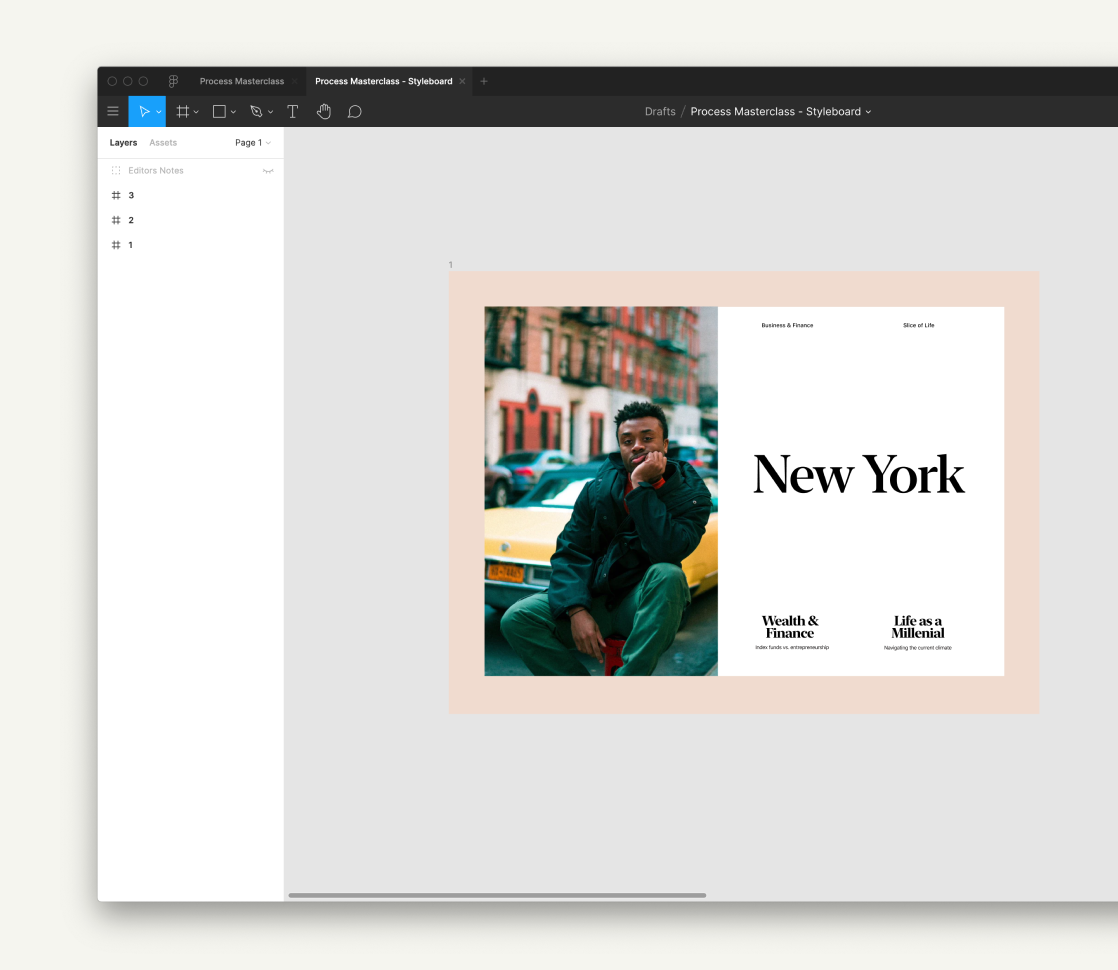
Images from unsplash that fit the target audience and then mocked these up in Figma. You can also use Midjourney and other photo options.
Another approach for Ad Creative.
You can also show prototypes to stakeholders or in your case studies.
Once you have your screens you can contextualise like some of the screens below.
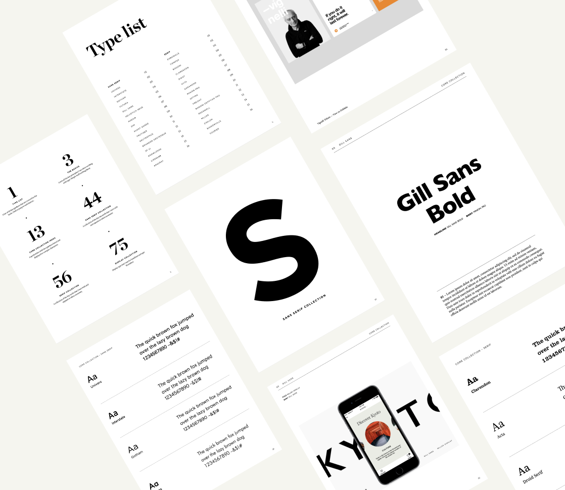
Then finally screens from your style guide. Things we look for are typography, colors and visual design elements.
Combine all of these elements with the metrics, team work and decisions from Part 1 of this case study and you will have a solid case study for your portfolio. A good collection of artifacts that you can present to stakeholders and key areas to work on with the project team
The design is never done
Product design is never finished. You only have the latest iteration. Once you have designed the screens, tested them and moved them live to production. You must measure and learn to see how they are performing.
You can utilise design sprints to implement new ideas and features
Customer feedback → Value → Hypothesis → Design Sprint → Feedback Loop → Implementation → Repeat → Gain a Competitive Advantage → Build an ecosystem
Remember the best products aren't the flashiest or the ones that designers applaud and share the most. It's the ones that solve a need extremely well, that overdelivers and undersells, and has an extremely loyal fanbase. Sometimes they are just extremely simple things that solve a problem really well for a specific audience.







No Comments.