May 31, 2022No Comments

UX Design, Psychology & Human Behaviour

Written by Nguyen Le

Understanding human behaviour is a big part of UX Design. There are many principles we can learn from fields such as psychology and marketing, to better our design thinking and decision making. So let's explore same basic principles and concepts that we as designers can use in our work. These concepts are also great for framing stakeholder buy in, which is a role not talked about enough when it comes to being a designer. So let's run through some of these useful concepts.

Cognitive Load

Cognitive load refers how mentally taxing it is to do a task. It is essentially a way of referring to how much sustained “brainpower” is required to do something. The more complex a task is — that is, the more contextual details of the task that the user has to keep in working memory. And the more the task demands a high level of focused attention — the higher the cognitive load is for that task.

What can we do? Reduce unnecessary actions, friction and noise

Cursor is already activated – I don't have to select before searching.
Voice Interfaces - when working well can reduce cognitive load and friction

Tactics such as chunking and step forms safeguard against cognitive overload.

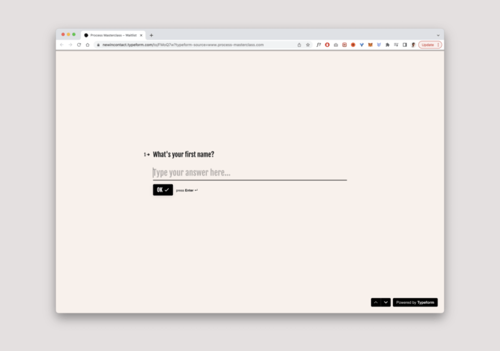
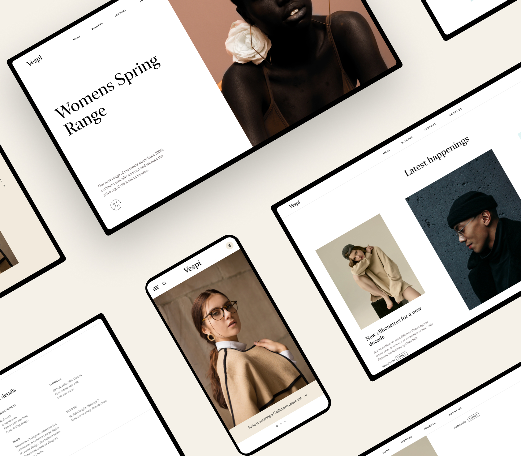
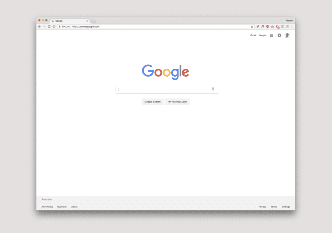
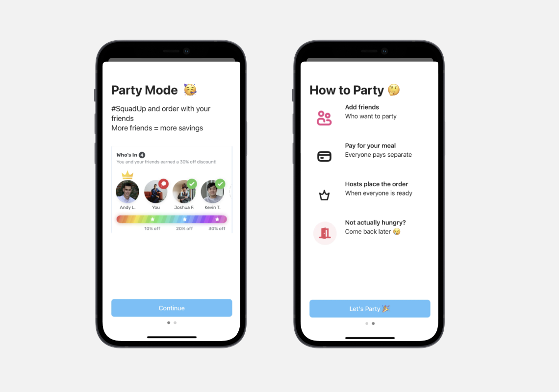
Typeform makes forms more approachable by presenting one input at a time. It makes things easier to digest when you chunk a relatively short form like this.

Hicks Law

Hicks law is the concept that says that the more choices you present your users with, the longer it takes them to reach a decision or action. Which of the two makes it easier to select an option?

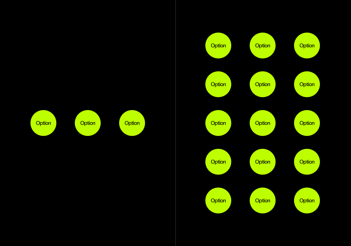
Too many options and pathways, makes things longer to process.

It's a balance between discoverability and simplicity.

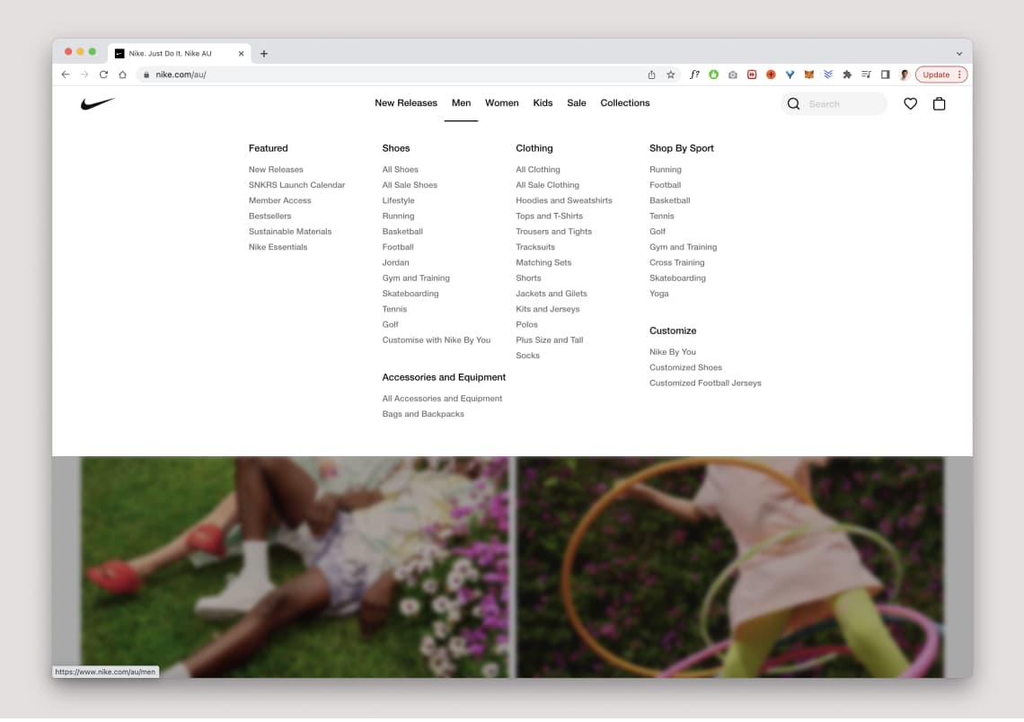
Simplify options with a lot of choices. But also bear in mind that people use more of what they can see. Balance essential tasks and information. Here Nike have hid most of the items under the top navigation Men. When hovered it is broken up into category with sub categories. All items are displayed to allow efficiency and speed. But the clear categorisation of items aims to reduce cognitive load where possible.

Learned Behaviours and existing Mental Models

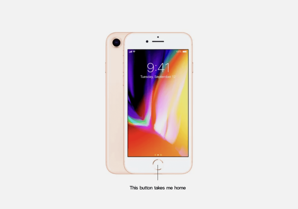
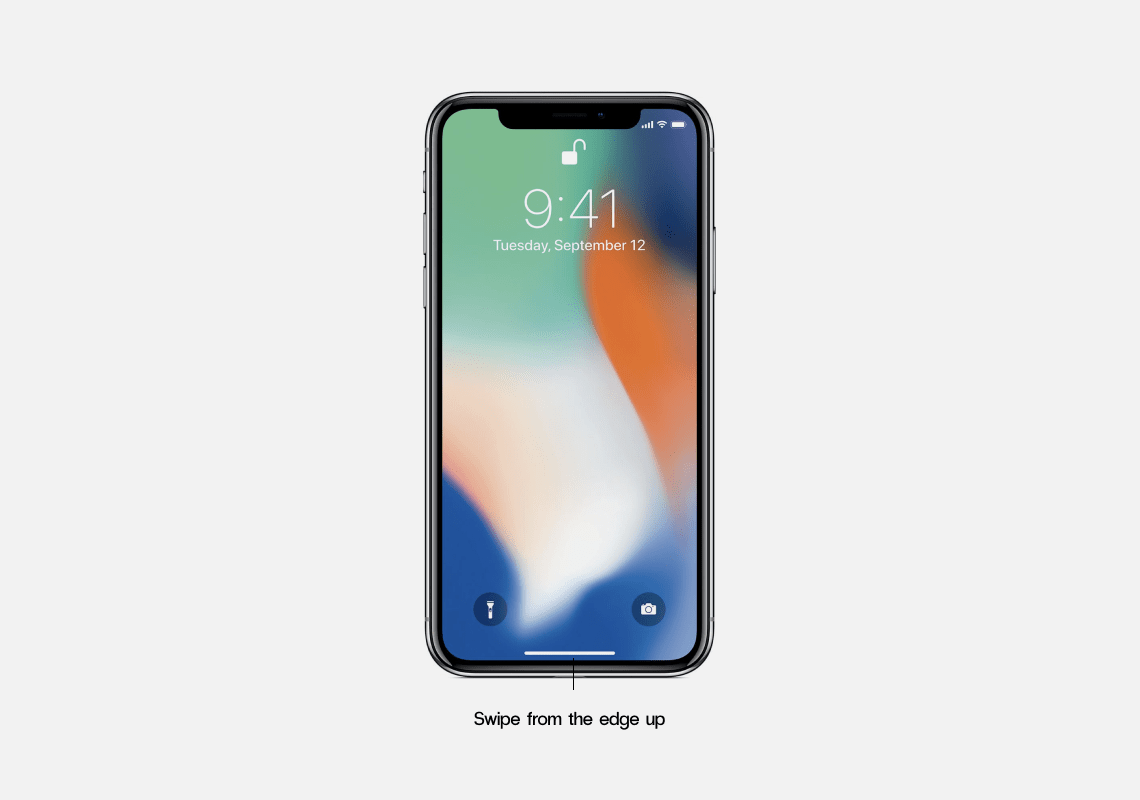
A bit of a semi old school reference here, but it was a significant change that demonstrates the point of existing mental models and learned behaviours. Like the transition from having a home button to no home button on the iphone.

Your users context and past experiences matter, towards discoverability and how they use and understand things.

What does that instance on the the top left mean? It's a menu button. Easy for designers to know, but what about users seeing this for the first time. We have contextual understanding due to learned behaviours.
What does this button do? Bit harder since we have no mental model for this icon.
It's the app store. On subsequent visits it becomes easier to recall.

Understand who your users are, what they know and how they think. Leverage past experiences to reduce cognitive load.

Design Patterns are your friend

In software engineering, a design pattern is a general repeatable solution to a commonly occurring problem in software design. Or create experiences that learned behaviours can be remembered easily, and become habitual. You can search for common design patterns on sites like Mobbin.

New and unique features can be explained by onboarding.

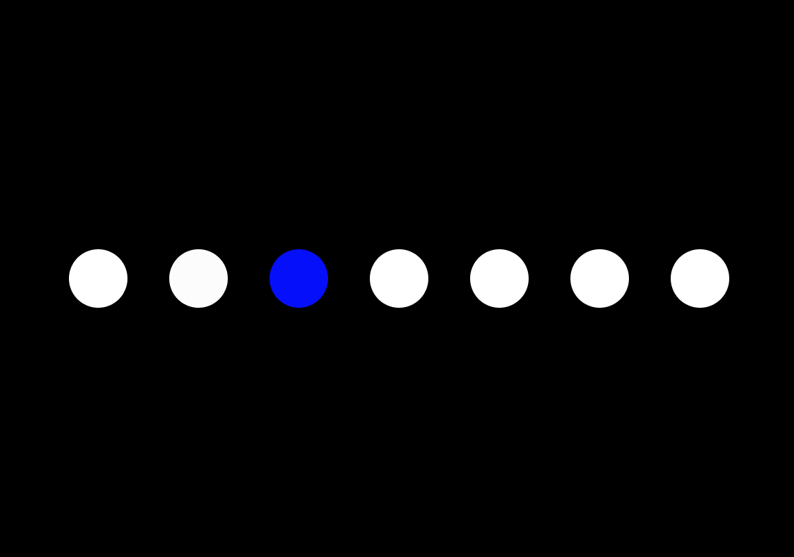
Von Restorff Effect aka isolation effect

‘One example, known as the Von Restorff effect, is that, in any given number of items to be learned, an item that is notably different from the rest in size, colour, or other basic characteristics will be more readily recalled than the others.’

Use the isolation effect when we want to bring attention to key area. Like for call to actions to clearly stand out from the rest of our layouts etc.

The isolation effect at play – as designers we tend to use this pattern intuitively

Cocktail Party Effect

The cocktail party effect refers to the ability of people to focus on a single talker or conversation in a noisy environment. For example, if you are talking to a friend at a noisy party, you are able to listen and understand what they are talking about – and ignore what other people nearby are saying.’

Imagine that you’re using a website, and suddenly you see your name highlighted on the page. Once your eyes see it, they immediately focus and pay attention to it. This is the same effect but using visual as opposed to auditory input of the senses.

We are selective in what we pay attention to. We have to be, because our brains can’t pay attention to everything, it would be too much cognitive load to do so. This is why in the design of websites/apps/digital products, it’s necessary to think of the user’s goals. What are they looking for? What is going to resonate with them? Which copy is going to draw their attention because it resonates with their interests and needs?

Create information architecture and copywriting inline with how people think and what they’re searching for or looking to do.

Lessons from Don Normans – The Design for everyday things

Affordances

Are the relationship between an object and a person. It is what an object is capable of doing based on the ability of the person and a particular scenario. Even if an object can afford to do different things if the person doesn’t know about it, even if the property exists it doesn’t afford the functionality or ability. Because some affordances are perceivable and some are not. 

And if the person has limited ability then the object cannot be used for it’s designed intention. Which is no fault of the person. 

As you can see different objects can afford different things, to different people. Because it is not just a set of properties that an object has but it is the relationship between the person and object. 

For example a chair allows us to sit on it. But it can be also used as a device to stand on to reach something. But not every person will use it for this purpose. But it’s properties determine that it can do this. If it is also a heavy chair, not every person will be able to easily lift it and move it around. A chair can also be thrown, be pushed over, and can rest objects on top of it. So you can see a chair can afford many different use cases.

Affordances are interesting because it doesn’t just look at the properties of an object, but the relationships that can exist between person and object.

The work we create can afford different things to different people, and sometimes they are used in a ways that we did not intend them to be. Or people did not realise what we’ve created can afford certain abilities. 

This is interesting insight because it thinks about the relationship of objects and people. Not just the properties of the object itself.

Signifiers

Are communication devices to cue the user on what something can do. Affordances determine what actions are possible. Signifiers cue the person on where the action takes place. They can help guide a person on the function, limitations, or actions of an object.

Animations, color, sound, labels, dimensions, positioning and depth can all help signify an objects affordances. To get people to use things we have to create great signifiers. Feedback is a concept about letting the user know the results of an action.

If you push a button and a load timer goes on, that’s feedback. It lets the user know that something is happening as a result of that action.

Conceptual models

Are simplified model, of how something works. When we look at a smartphone, we see icons on the homepage. We can tap on any of those icons an app will load. The conceptual model is a series of apps that we can use for entertainment and utility. But behind the scenes there are heaps of circuits, code, batteries and wires that are enabling to happen. Yet we are not conscious of the things that are happening in the background.

So the conceptual model is a simple one in the mind of the user, vs. what is actually happening in the background. The people who designed the parts, the wiring and the engineering behind the product know it as something different. 

So the conceptual model that a designer has can be different to the conceptual model that a user has. The designer or engineer, can see the parts behind the scenes. It’s important that they take into account what users might see, think or do as well.

Now to create great products it’s about being aware of this disconnect and joining the two points of views together.

The System Image

Is the actual object itself. That’s the thing. It can be a website, app, device, installation, unit – objectively it can be interpreted in different ways. A designer can see it as one thing, and a user can interpret it as another thing. It’s about joining the viewpoints of both. And that is through empathy and some of the frameworks we’ve discussed so far. Some great food for thought.

Final Takeaway

We can borrow ideas and methods from psychology and marketing greatly to enhance the designs we are creating for users. Understanding certain principles and theories can help us be more insightful in our approach. Be sure to check out all the awesome psychology principles on the convertize site. With great power, comes great responsibility. Use it ethically! 

May 2, 2022No Comments

UX Design – Storyboards, User Epics, User stories, User Research and Design Sprints

Written by Nguyen Le

Jump straight to the UX Design methods

The Backstory

Over the course of my career I’ve had to expand my skill-sets overtime. In order to fit the various roles that I’ve had. During the milk moustache junior designer days. When I came into the design industry purely as a craftsman and focused mainly on the visuals. In those days great aesthetic and flashy designs were enough to be considered great work. However as I gained more experience, the requirements of my job changed. I had to deep dive into usability, UX design, leadership, business viability, marketing and a host of other complementary skills. In the span of over a decade. You never really stop learning in this industry.

My love for the craft however never died, I still wanted everything to be beautiful, to still be hands on and to make stuff. But I realised there had to be more to the work we created. To be exceptional the work we created needed to have impact for business viability, behavioural/social change and to deliver value. The work needed to put people/users at the center of our decisions. To be more human-centric in our approach. To deliver on an outcome, a story, a feeling, a journey that could make a difference however small or large it was. 

What great designers do

The best designers I believe are the ones that are capable of thinking and executing across the spectrum of the design process. To look at things from a macro level – How does this product fit into a businesses product offering, brand and overall bottom line? And how does this product fit into the lives of the users and customers we are servicing? To also having the ability and the chops to execute on this information – implemented through sketches, wires, prototypes, visual design, testing, iterating, collaborating and launching. To get that balance of researcher, thinker vs craftsman and visual designer. 

Simplifying UX design

Today I hope to help you with the research and thinker side, and share with you simple frameworks that I use. Please excuse the wanky terminology that our industry has standardised as UX and Agile. The terms don’t matter too much. So I’ll simplify it and codify what it means to me – Remember you are designing things for real people. If you are designing a website or an app there are real people on the other end that are going to use it.

Whether they are at home on their laptop wearing their pyjamas. At work on their computer browsing on their lunch break. Or on the bus and browsing it on their phone as they commute to work. These aren’t mysterious “users”, they’re just people going about their days and your work happens to interact with a small slice of time in their lives. (Or an integral part of their lives)  You can frustrate them, delight them or you can be wonderfully invisible in the work that you create. 

Incorporate the thoughts and needs of users

The better you incorporate the thoughts and needs of these end users in your process the hope is that you will deliver a better product. Great work and a ton of processes is not a guarantee. Only when you get it into the hands of real people and the overall market can we see if something is working. And then you iterate and improve from there. Is engagement going up? Are we getting more traction? Is the business bottom line improving? Are people happier? Are we doing what we set out to do? Being user-centric is beneficial from a business standpoint as well, so it is not just hocus pocus “users” are awesome type stuff. There is business viability in the mix. By creating great experiences we are building loyalty, connection and evangelists through the work we are creating. This contributes to the bottom line and overall brand equity. 

So how should you approach your work when you are staring at documents, a brief, your blank figma canvas. What should you think about? Well try to understand - what people's motivations are, what drives them, what do they need to do, how do they feel across the overall journey? Who are they exactly? How can you codify this and give meaning to this?

Below are some great articles and resources that can help you uncover some of these insights. These are the very methods I use in my own work. Some of it seems so over the top ← I used to think so and still do from time to time. I think the key is to understand the principles that can aid you in effectively improving/bringing a product/design to market. The results of your work don’t lie. Having thick documents doesn’t mean you’ll create a successful product. It’s about creating that balance of research and rapid execution. 

User Research

You can conduct interviews, surveys and look at analytics to get a clearer snapshot of who your end users are. What they want to achieve and what they do. To get started start integrating user feedback and user research into your design process. Below is the resource I recommend to get started.


Personas

This is where we give meaning to the research we’ve conducted. To create realistic representations of our users, their goals/characteristics and the outcomes that they want. Ad agencies go ham on these. I prefer simple templates as reminders that hey this is who you are trying to service. (I like the one Roman Pichler uses) My persona templates vary on complexity depending on the project. Remember not every project is the same - so think contextually about if you need personas at all and how much complexity you need.


Storyboards

When designing beyond the wireframes, technology, visual design and coded site or app. Storyboards are a great visualisation tool to see how a product can integrate into someone's life. And what the overall customer/user journey will look like. Airbnb did this effectively with some of their early day product designs. 


User stories

User stories are essentially a way of thinking about functionality of a page/site/app from the point of view of a user. What do users want to do? And from there we can design the functionality required to achieve the task that they need to perform. As opposed to saying newsletter signup form. You pen it from the perspective of the user. “John (persona) would like to receive updates via email, so he can get the latest content from XYZ ”.

The benefit of this is things become user-centric and not technology or internally focused. User epics are extensions of user stories. I like to think of it as a larger user flow. So user stories are individual features that can be implemented, user epics are a series of user stories that need to occur in order to reach a certain outcome.

Example of a User Epic

A user epic might be “John(persona) wants to be able buy a pair of indigo, skinny fit jeans, in size 32 and wants them delivered to his office because he’s not home during the weekdays.” You can see how a series of features will need to be implemented to achieve this. 


GV Design Sprints

Design Sprints

Design sprints are a defined time period 4-5 days/ a week, where we can implement user stories, prototypes and testing to answer or get feedback on a business problem, a user benefit/feature/problem and seeing how users take to our solution and hypothesis. It has the principles of design thinking with a clearer execution roadmap.


Once you get your head around this stuff, try to start implementing some of it. All these methods are extremely simple, our work as designers is not that complicated despite all these epic terms haha. So start improving the UX design side of your work.

July 24, 2021No Comments

How to break down a design project

Written by Nguyen Le

I have a simple method for breaking down a design project. And it starts with answering these key questions.

The 7 key questions for a design project

  1. Who are the key user types? (Identify them)
  2. What are the “jobs to be done” for each user type? What do they want to do efficiently?
  3. What are the success metrics for the project team/key stakeholders? If we completed everything successfully- what would success look like? What are the key Metrics/Outcomes we are trying to move?
  4. What is the projected timeline for the project?
  5. What is the project worth?
  6. Who are the stakeholders involved and what are each of their goals?
  7. Who is on the project team?

Once you have this information you can synthesise everything together into a cohesive roadmap, strategy and execution plan with stakeholders and the project team.

All wanky sounding terms. But essentially it’s gather all the above information, make sense of the above information into a clear set of goals, create a plan based on said and agreed goals. Put the plan into action with the team. Design, Prototype, Test, and Iterate across the lifecycle of the project. Once you make things put it in front of people. But not just anyone the people who will use the product/service you are designing.

I use an agile methodology. We test and learn along the way. More partnerships with everyone involved. Vs. Let’s make everything in a cave do a big reveal with the client. Then just launch everything into the world at the end in a step by step manner.

Project example

Let’s have a look at the above project in action for a hospital website.

1. Who are the key user types? (Identify them)

  • Patients
  • People to be admitted
  • Visitors/Family+Friends of patients
  • Staff/Doctors
  • Staff/Nurses
  • Staff/Administrators
  • Carers on behalf of patients

2. What are the “jobs to be done” for each user type? What do they want to do efficiently?

  • Patients - need to find a specific room
  • Patients - need to know appointment times
  • Patients - need to know which ward and wing they are admitted under
  • Patients - want to learn more about doctors and surgeons
  • Patients - want to get in touch with a specific doctor/surgeon
  • Etc. Do for all user types

3. What are the success metrics for the project team/key stakeholders? If we completed everything successfully- what would success look like? What key Metrics/Outcomes we are trying to move?

  • Reduce inbound support calls
  • Be able to schedule patients in seamlessly
  • Have clear patient data that is accessible to admin staff
  • Improve the current mobile experience

4. What is the projected timeline for the project?

  • Tenders will be reviewed. A vendor will be selected on 21 January. The project will commence on the 1st of February with a projected completion date of 14th June. (We will be advised further by the selected vendor)

5. What is the project worth?

  • $285,000 budget for design and development

6. Who are the stakeholders involved and what are each of their goals? (Add goals to each of these stakeholders by interviewing them)

  • Head of Marketing - Sam Plight
  • IT lead - Vinesh Ramjik
  • Admin & Operations Manager - Stephanie Rice
  • Project Lead - Hanh Zo
  • CEO - Amanda Francis

7. Who is on the project team?

  • Creative Director - Nguyen Le
  • Design Lead - Justin Grathje
  • Copywriter - Tait Hill
  • Producer - Varenka Schill
  • Director of Technology - Lauren Powell


Once you have all this synthesize it together. Collaborate and divide and conquer together 🙂

July 24, 2021No Comments

A no bullshit primer on UX Design

Written by Nguyen Le

A lot has been written about UX or more correctly UX design. UX is just user experiences, and we have experiences with all sorts of things in our everyday lives. From using a fork to sitting in a chair. Even you in this very moment, am reading this on a phone, tablet or desktop. This is an experience and you are a user 😉

I’ve been working in this field and craft for over 10 years. And have seen so many wanky terms get thrown around without much weight or meaning. The buzzword of that month or that year. Web 2.0, cutting-edge, social media, usability, UX and so on. In resistance to the early 2000s when designers were trying to rack awards through self indulgent flash designs, came about those that thought about usability.  Good information architecture, site mapping, heuristic evaluations and usability testing. To make things more understandable.

When the era of masturbatory design died companies needed to jump ship. Most companies began championing usability and UX design in direct response to this. Thinking it was one in the same. All smoke and mirrors. How do I know? Because I peddled some of that bullshit. But the more I uncovered in time, I realised there was truth and substance within the hype. But it is much more than the facade that companies are putting on today. Or what a lot of design schools and UX schools teach.

I’d say the term is a lot clearer today, but I still see a lot of weird shit floating around. I don’t care about textbook examples. I care about results, about driving growth, and about people. About users. So let’s start by what UX design is not. UX design is not about drawing boxes or wireframing. And it's not about doing cool new interactions. “Wow that’s great UX!!!!!” No that’s a nifty prototype interaction. It’s not information architecture or having photos of you putting post it notes on the wall. Or a list of check box items you tick off. User Personas etc. 

UX design is very simple. The objective is trying to design a great experience for the user, one that exceeds expectations and delivers on extended value. Simple stuff. But that comes in a variety of shapes and forms. A great experience for one market or audience may be horrible for another. Sometimes you want a place to know your name and strike a conversation with you, ask you how your day was etc. (Starbucks experience) Other times you just want empowerment to get something fixed immediately without having to call a call centre. Or to rely on someone else. Utility tools to enable you to achieve this. (Google, Airbnb) When there are hundreds of different touch points with a brand or product how do you create a consistently great experience? Therein lies the challenges. 

In today's landscape. The experience and the service IS the brand.  

UX design is about anticipation, intention and outcome. 

  1. You anticipate what users want by first understanding who they are. 
  2. What they intend to do. 
  3. And the outcome they hope to have. 

It’s about a person’s expectations with your brand and product and then delivering beyond that promise. To deliver a great experience, through a designed system. What users say, feel, think and do is at the heart of designing for a great experience. That’s the aim of the game. You can only service someone if you know who they are and understand what they want. Their hopes, dream, fears, motivations and feelings. It is a very human approach. Remember we don’t design the experience itself, because that comes down to the individual. What someone feels and experiences is personal, we don’t design that experience. But we facilitate the interaction and the product that can positively influence that experience. And how it fits into their lives and their story. Before you get to pixels it is important to see this vision.  So why does this matter from a business standpoint?

The goal of UX design in business is to “improve customer satisfaction and loyalty through the utility, ease of use, and pleasure provided in the interaction with a product.

OXFORD JOURNAL

This is not only the right thing to do, because first of all we are not creating junk. We are delivering value by being good to people and not fucking them over, it acts as a competitive advantage in a crowded marketplace. Part marketing, part design, part business vision.  In a world of shareability, with more information and more transparency you can’t get away with average or shitty experiences anymore. You'll get sprung out and people know about it quickly. Unless you are the only service provider people will go somewhere else. (Netflix vs. Blockbuster, Uber vs. Taxis, Airbnb vs. Hotels) Likewise if you exceed people’s expectations you are creating brand advocacy and loyalists. There’s a whole framework around this called a Net Promoter Score prevalent in business and particularly startups.

Net Promoter or Net Promoter Score (NPS) is a management tool that can be used to gauge the loyalty of a firm's customer relationships. It serves as an alternative to traditional customer satisfaction research and claims to be correlated with revenue growth.

Nothing is more powerful than word of mouth advocacy from someone you trust. The best experiences think about psychology and human behaviour. Knowing when to be invisible, when to be fun, when to be reliable etc. 

That’s why nimble startups can disrupt huge organisations, through utilising good design and delivering great experiences. (Of course I am not disillusioned that there are many more variables at play, but today design does play a pivotal role in this competitive landscape)

At the heart of a project, this is what we should try to uncover and consider.
What do people say they want?
What do they really want?
What do people want to achieve? 
What are the edge cases? (Make this great as well)
What are people's expectations? How can we deliver and then exceed that? 
What do you want people to feel? What are they actually feeling? 
Does the story and design we’ve crafted deliver on great outcomes and a great experience for users? If not where are the weak points and how can we fix this. 

There are many UX design tools to aid us with this, and they sit within a bigger framework. The methodology and process I use is Design Thinking and the lean startup model. We look at data/analytics, observations, user insights etc. This article is not about those techniques but more about a mindset and an approach to thinking about UX design. 

Too many people care about ticking checkboxes and requirements to cover their asses rather than what people actually experience and the outcome that generates. I’ve seen process riddled research, equate to work that was no different than if there was no research done at all. Or usability tests done once, not hoping to find pitfalls but were bias in their execution just to validate what was already there. (Changes are wasted billable hours) The best designed experiences occur through a constant iterative loop. There’ll be a lot of problems and fuckups. Technological restraints. Resource restraints. They are gradual steps. Observing, watching and listening to what users are saying, doing and feeling. And constantly executing and evolving based on that. Prototyping, testing, doing live A/B tests and surveys. An ever changing product, that constantly changes. Understanding that end to end process at every touchpoint. So create a lot of prototypes, go live and get as much feedback/data from users as possible. Prototype > Test > Launch > Listen > Test > Grow. Repeat. 

And then you fall back on this:
What are people's expectations? And how can we deliver on that expectation and exceed it? 
Surveys, observations and a good NPS. 

Over time your product becomes more proactive, invisible and integrated into one’s life. As opposed to one that is reactive. Those are the best systems. Or products that constantly provide value to one’s lives. 

The purpose of your product may be: 
Utility/function – Solving a pain point
Entertainment – Delivering value through entertainment
Empowerment / Community – Connecting people and allowing a platform to have people at the center of the product/design system. 

Get the basics right. Make it functional, usable, beautiful, fun, delightful. And then make it so good that you create brand advocates/brand loyalists that spread the message. (Think of the cult of Mac and Apple users) That you your users and create communities around that. That is the leverage of good UX design. And in my opinion just kill the UX part. It’s simply good design.  

By 2020 customers will manage 85% of their relationship with an enterprise without interacting with a human.

HARVARD BUSINESS REVIEW

So why should you care as a designer?

You have an opportunity to be a change maker. Digital products will shape and ARE shaping the future. You find perfection through iteration and process. Digital product designers, think holistically about the design from a craft point of view, a business feasibility POV and an advocacy for designing great user experiences. Competency in UX design, is part of that spectrum for being a highly valuable designer. Capable of bringing value to any a large business, a startup, an agency or your own business. So to which we end. Do you know what users think about your work? And do you care enough to understand them.  SHARE

July 24, 2021No Comments

The Lean UX Design Canvas

Written by Nguyen Le

What we do as designers

Collectively as designers we try to design solutions and experiences that are beautiful and useful using various tools and techniques. But at the core of what we do is the servicing of user needs and delivering on business objectives. Satisfying these 2 pillars are the benchmarks to our success. Creating beautiful and emotive work is a byproduct of these goals and occur through constant discovery, prototyping and iterations.

Design/Product Teams unite people with various skills and disciplines to complement each other towards a shared vision. Illustrators, developers, researchers, product designers, visual designers etc. As mentioned in last weeks article about what UX design represents. This week I wanted to share an actionable framework that can help you with your next project.

Lean UX by Jeff Gothelf

It is a great framework/canvas created by Jeff Gothelf, the author of LEAN UX – Designing great products with agile teams. Digital product design is a messy and iterative process. In my opinion the best work doesn’t occur in silos, where one team comes up with all the thinking, then one team does wires and then we’ll get the visual designers to make it look good. It’s not as clear cut and checklist focused as that.

But more collaborative and scrappy. It appears through a lot of listening, testing, observing, prototyping and getting feedback loops that are both quantitative and qualitative from a live market and from users. The Lean Canvas allows us to focus on, business problems, business outcomes, users & customers, user benefits and how they intertwine with the business problem and developing a lot of different "solutions" to discuss, prototype and test. 

You can download this on Jeffs site.

At the end of the day your customers don’t care whether you’re agile, lean or practice design thinking. They care about great products and services that solve meaningful problems for them in effective ways. The more you can focus your teams on these things the better their process
will be.

JEFF GOTHELF

Not in your job description

Depending on your experience and organisational structure this workflow might not be in your “job description”. But thinking holistically about a projects approach and what you are trying to solve, builds key skills and mindset shifts that help you create better work. 

Whether you are starting out or just learning the craft side, take a moment to look through this. Or if you are more experienced and am looking for opportunities to improve and tweak your process and approach, this is a great tool to start delving a bit deeper. And becoming the catalyst for getting various team members on board. It’s a great exercise in bringing clarity for our 2 main pillars of success – business objectives and kick ass user experiences. 

See if you can map this Lean UX canvas to a project you are working on.

Once again this is a tool to springboard ideas and bring clarity to a proejct, it is NOT a guarantee to success or a great design. It allows you to sort many ideas and converge and prototype the best ones. I hope this tool serves you well.

Enjoyed this article? We've got more

unsplash-image

Learn how I made over $100k in my first year of freelancing, and the key lessons to help you do the same.

image-165

Thinking about going freelance or running your own indie business one day? I share some of the very lessons that got me to 6-7 figures.

typography-tips-thumb

Build a solid foundation with this typography series as I share my ins and outs for using type in digital design. 

image-166

A guide on how to approach UX design simply without over complicating things. This is my simple approach to user-centric design.

SOME OF OUR MOST POPULAR POSTS

Resources and freebies

Cover

Vespi Figma Project file

Here's a preview of the class project files in Figma. You can see how everything is setup - using grids, components, typography and creating a design system. You can duplicate this and have a play around. 

type-playbook

Grab our Type Playbook

A collection of typefaces, foundries, typography tips and more in this free eBook. Made for digital UI/UX designers looking to learn more about typography. Condensing 10+ years of experience into this resource. 

styleboard

Styleboard Figma Template

Use styleboards to work with clients to flesh out the initial art direction. To get a feel for how a project could look and feel. They are a quick and effective to way to communicate the art direction without sinking too much time. 

Become a more valuable designer

Increase your value as a UI/UX designer. Learn design thinking and design execution in this comprehensive online masterclass. Great for self taught designers, or those with 1-3 years experience looking to take the next step in their careers.

Join the community

Enjoyed the articles here? Join my personal weekly newsletter about design, business, life and things I'm working on. Sharing 15+ years of design experience, and everything in between.  To help increase your value as a designer. Join 20,564 designers.

Unsubscribe anytime. You're in good company, read by designers who have worked at Apple, Adidas, Google, Pitch, Facebook, Slack, Instrument, Work&Co.

PROCESS MASTERCLASS ©

Proudly crafted and made in Melbourne